1 / 1
DevRev's work item creation was slow and clunky. I redesigned the end-to-end experience, from entry point to post-creation, to help thousands of users capture work in seconds instead of minutes.
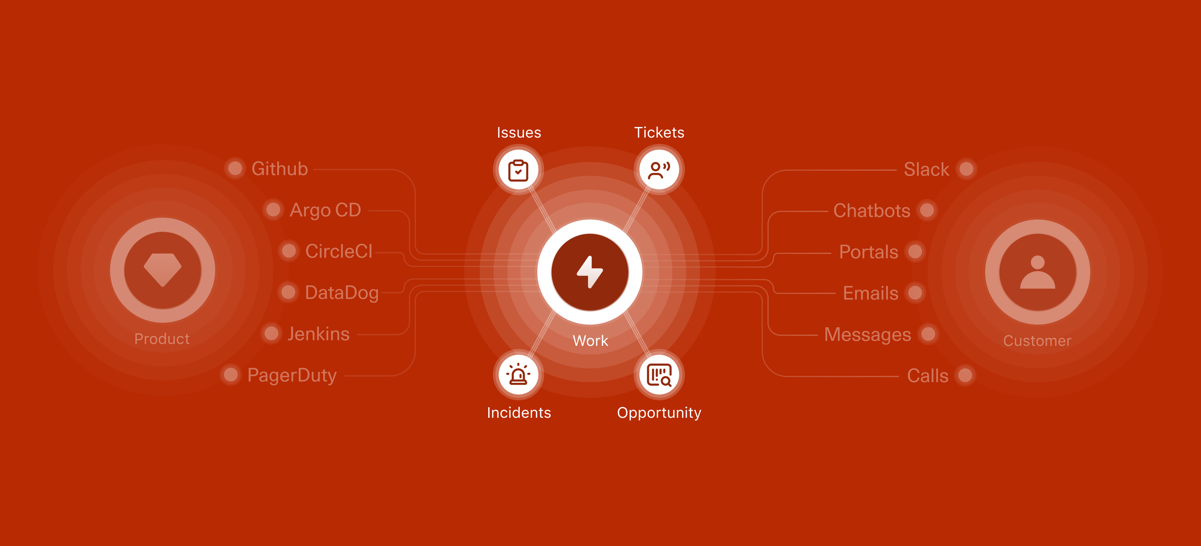
Most product teams run on a stack of disconnected tools, Jira for engineering, Zendesk for support, Salesforce for sales, and five more for everything else. Work gets fragmented across them, and context gets lost every time someone has to switch.
DevRev is a OneCRM platform that unifies the three most important things in any product company: the product, the customer, and the work they do. Rather than stitching together separate tools for engineering, support, and growth, DevRev brings them into a single platform.
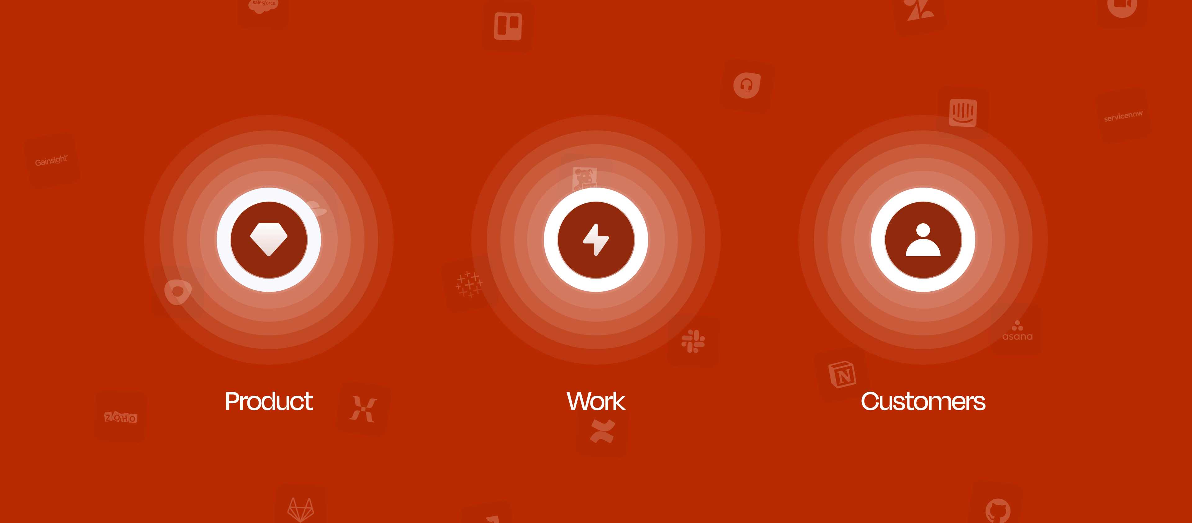
In DevRev, "work" is anything with a lifecycle, something that gets created, moves through stages, and eventually gets closed. It shows up in four flavours: Tickets from customers, Issues from engineering, Opportunities from sales, and Incidents during outages. Each one has its own fields and workflow, but they all start the same way: someone has to create them.
That first step, the act of creating, is what this project is about. If it's slow, everything downstream slows down with it.
Creating work items is clunky. It takes too long. This can be attributed to: too many attributes, missing context, low discoverability of subtype and templates, no duplicate detection, and poor keyboard support. This interrupts the overall flow and slows down capture.
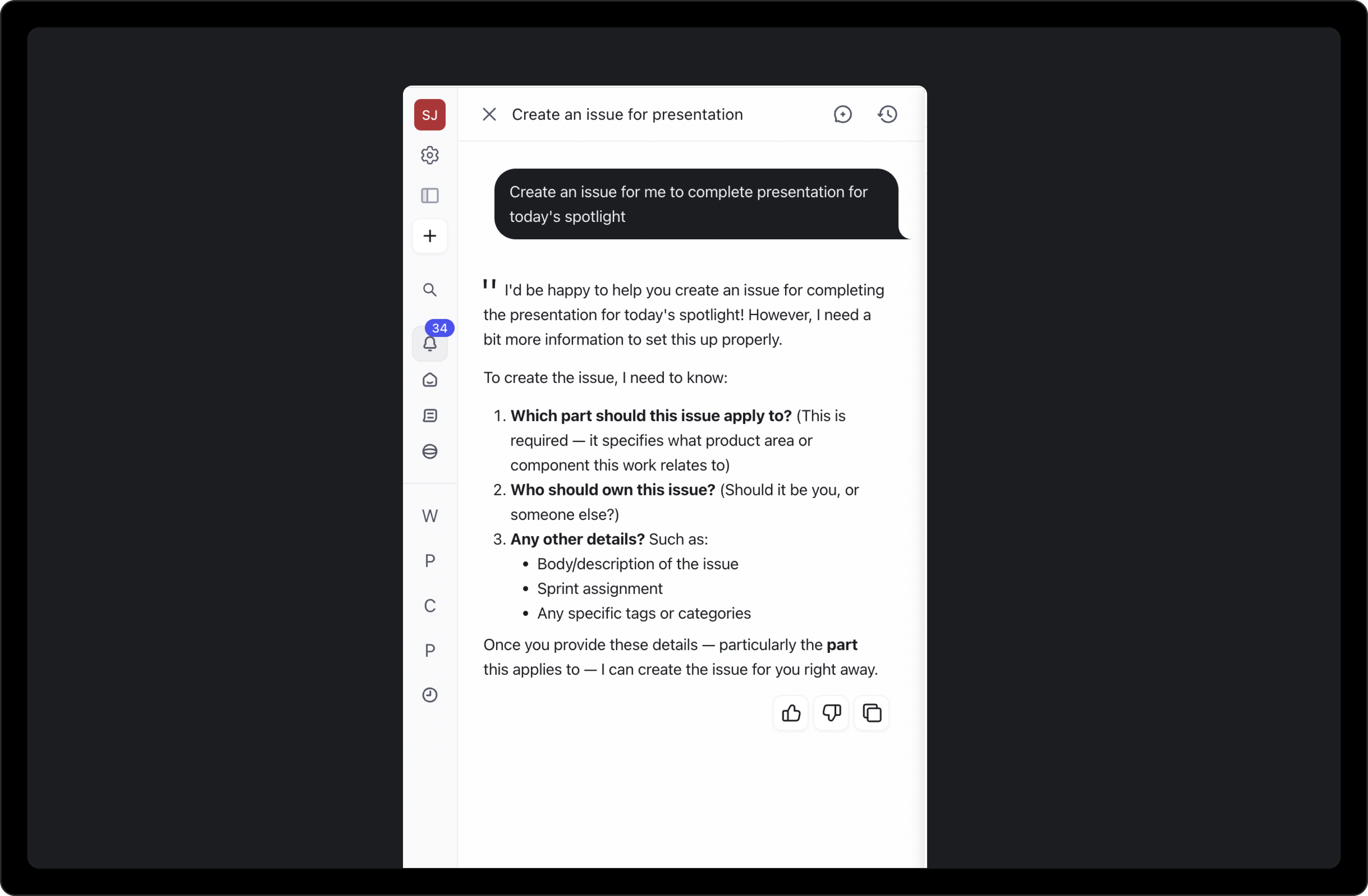
Creating work is one of the most common things people do in DevRev, but the flow felt like no one had designed it. Users just wanted to jot something down quickly; instead, they had to wade through a form.
Three signals made this an urgent priority:
I started by auditing the existing flow end to end. There were three surfaces to look at: the entry points, the creation form itself, and the AI path via Computer.
The only way to create work items was a Plus icon in the top-left of the nav. It opened a dropdown with a search field, where users had to locate and select the right work type before anything else. For one of the most frequently performed actions in the product, this was a slow and laborious entry point.
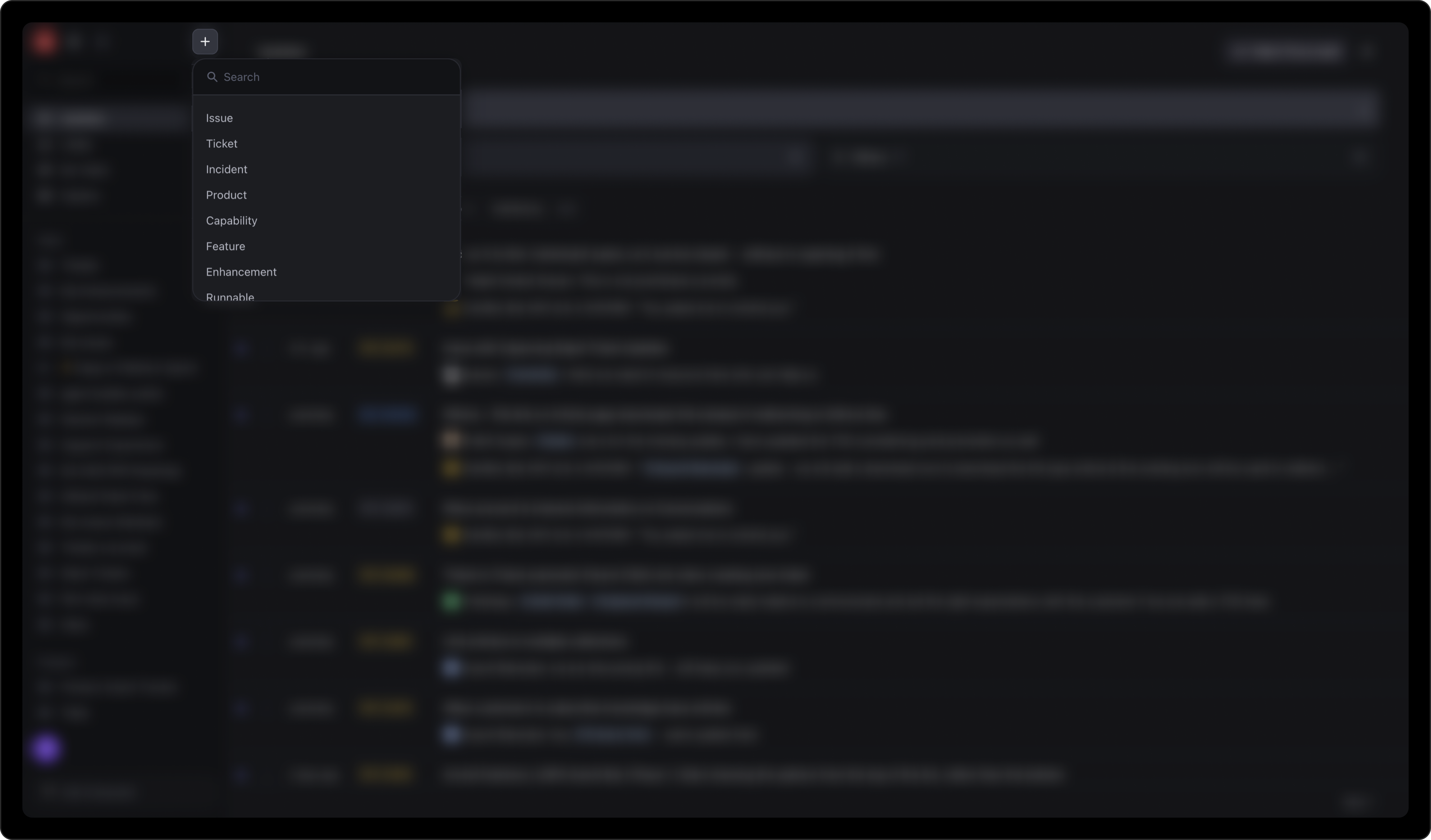
Most objects were created in a side panel, which inherited the constraints of the panel framework. The feedback from research was damning:
DevRev's AI assistant ("Computer") could also create work items from natural language descriptions. But this path had its own issues: it required verbose input, multi-turn conversations were slow, and it often missed context from the prompt, requiring users to repeat information. Computer is better suited for proactive work creation (suggesting items from meeting notes, for example) and bulk creation, rather than as the primary path for individual items.
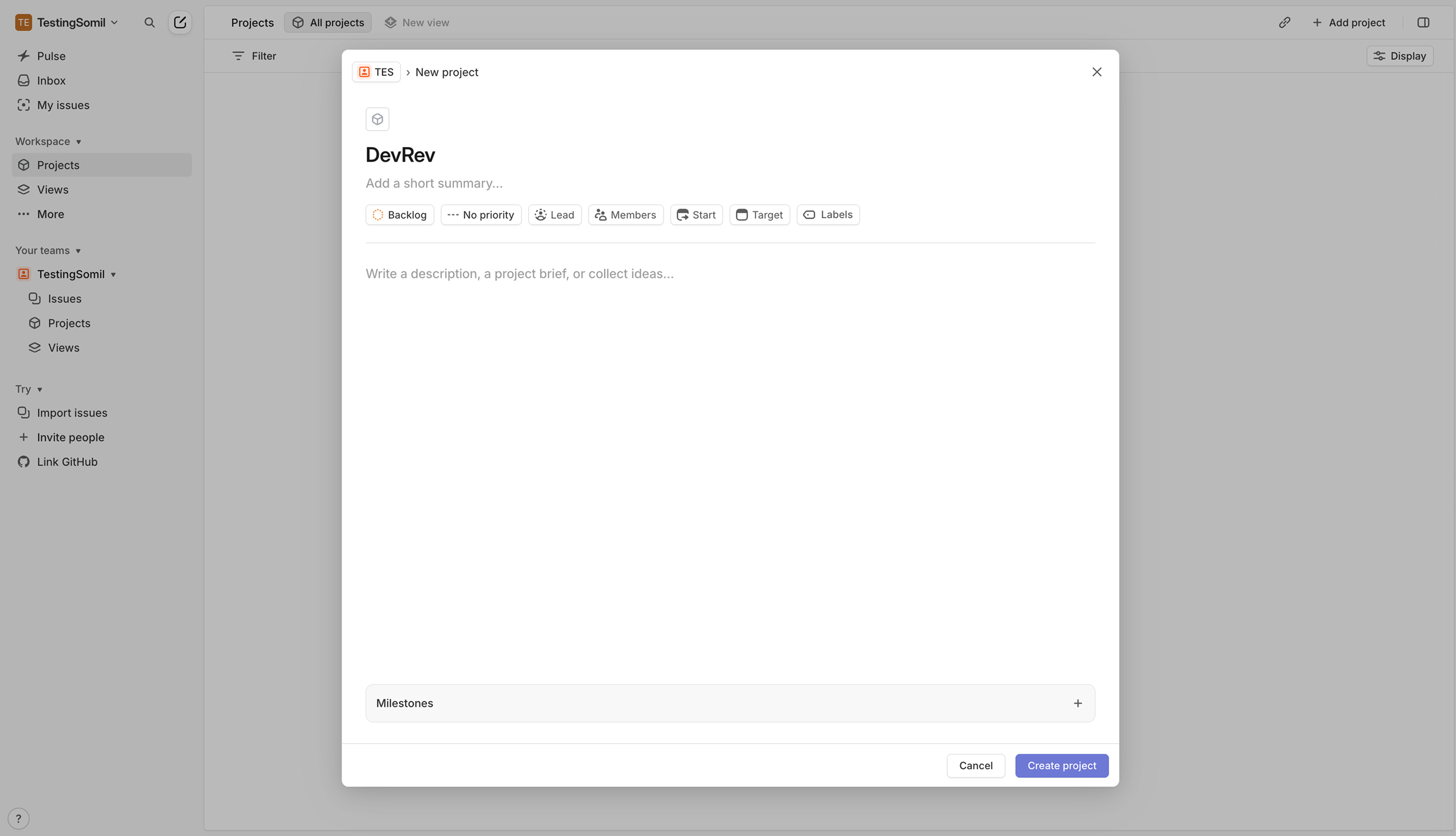
I looked at how other tools handle creation to see what the range of approaches looked like:
The pattern was clear: the tools that felt good to use were fast by default. Minimal fields, keyboard-first, no ceremony.
Redesigning creation end-to-end was too large to ship at once. We broke the work into three phases, prioritizing the highest-frequency objects first and deferring AI capabilities until the core experience was stable. Phase 1 is shipped. Phases 2 and 3 are in progress.
The redesign covered every step of the flow, from how you trigger creation to what happens after you hit Create. Walking through each piece below.
The entry point problem had two parts: speed for keyboard users, and discoverability for everyone else. Each was solved separately.
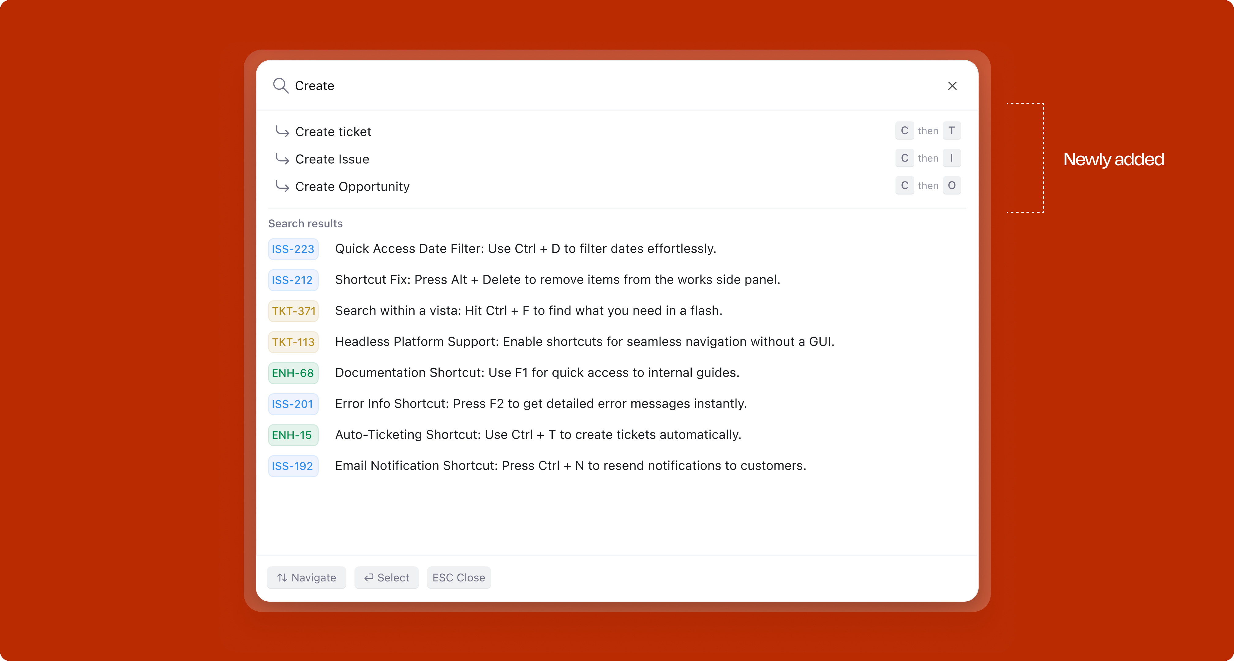
A chord-based shortcut system lets users jump straight to the object type they need:
For mouse users, the same flow is available through the UI. The object type menu is ordered by frequency: Ticket first, then Issue, followed by less common types like Capability, Opportunity, and Article.
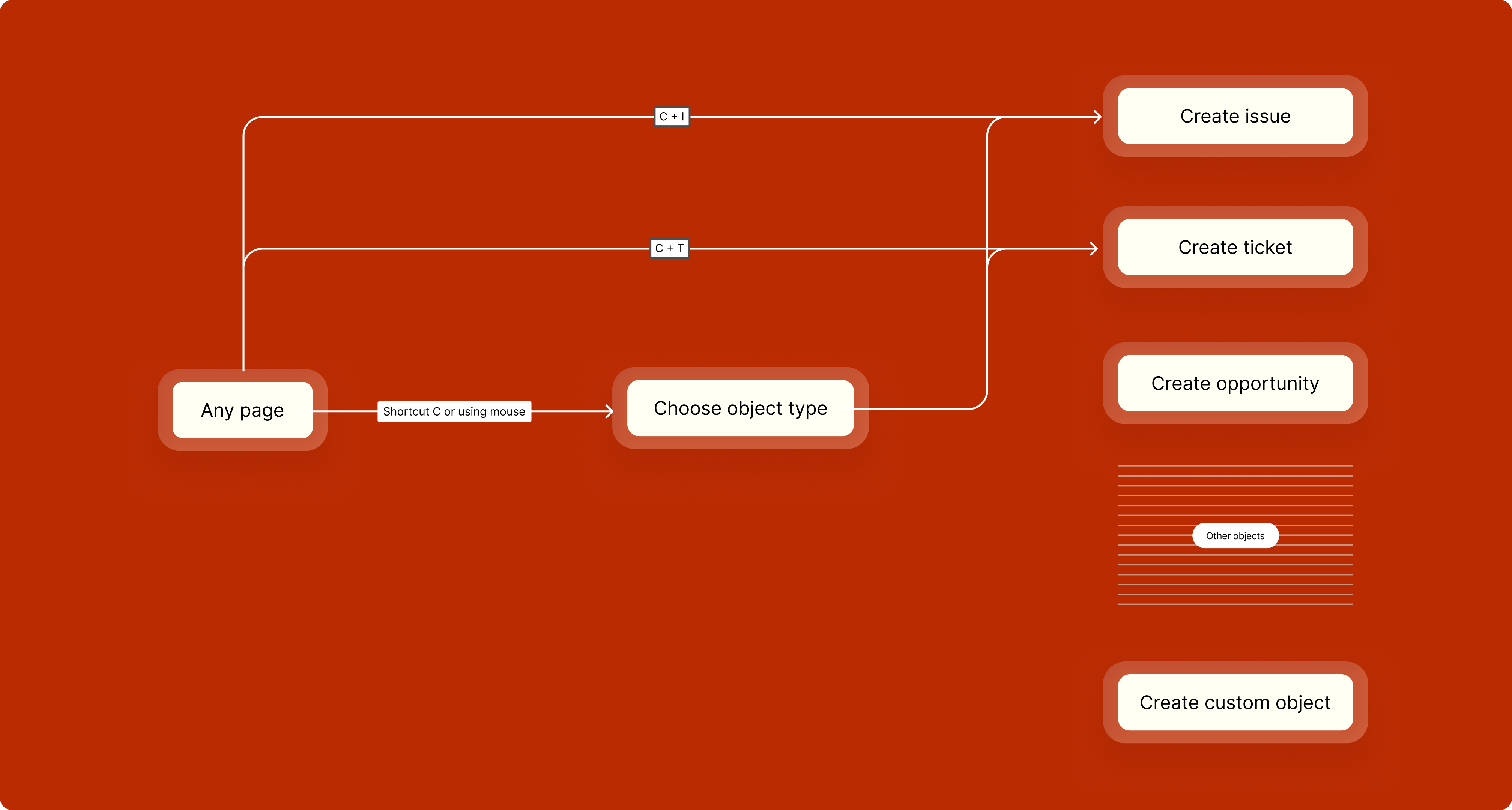
Work creation was also surfaced inside the Command K palette, so users who reach for the command bar habitually could create items without ever leaving that flow, accessible from any context, without needing to know the dedicated shortcut.
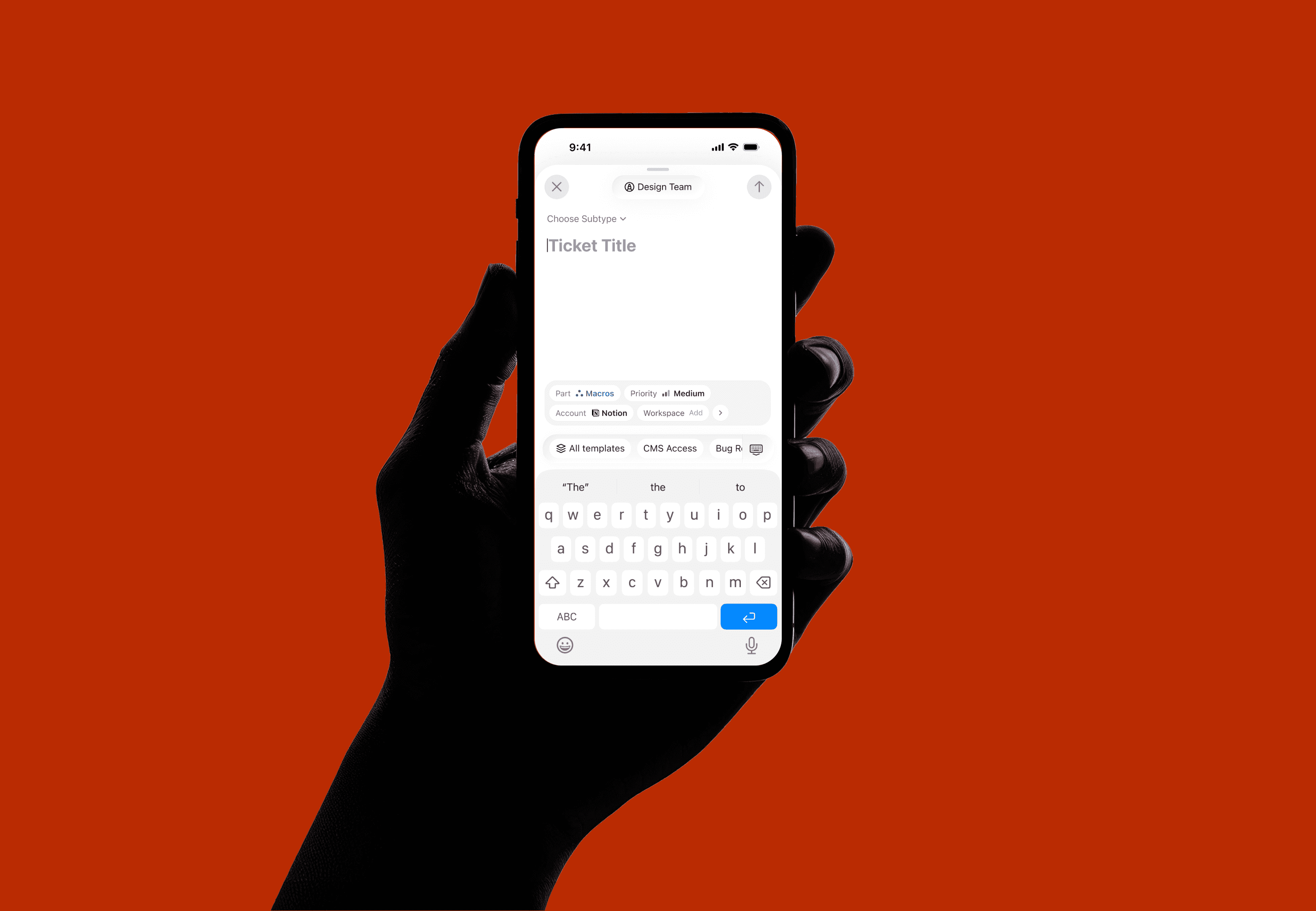
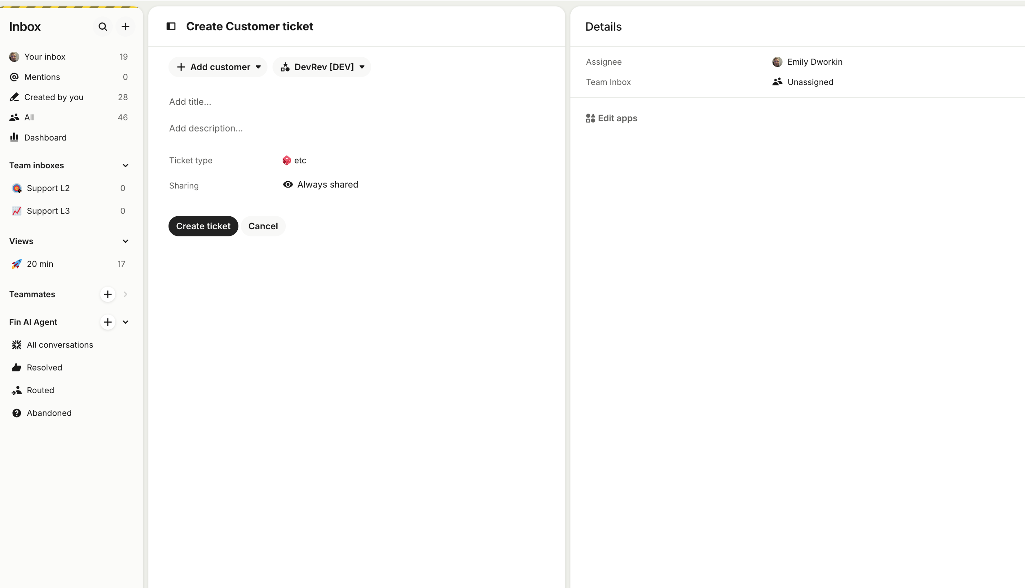
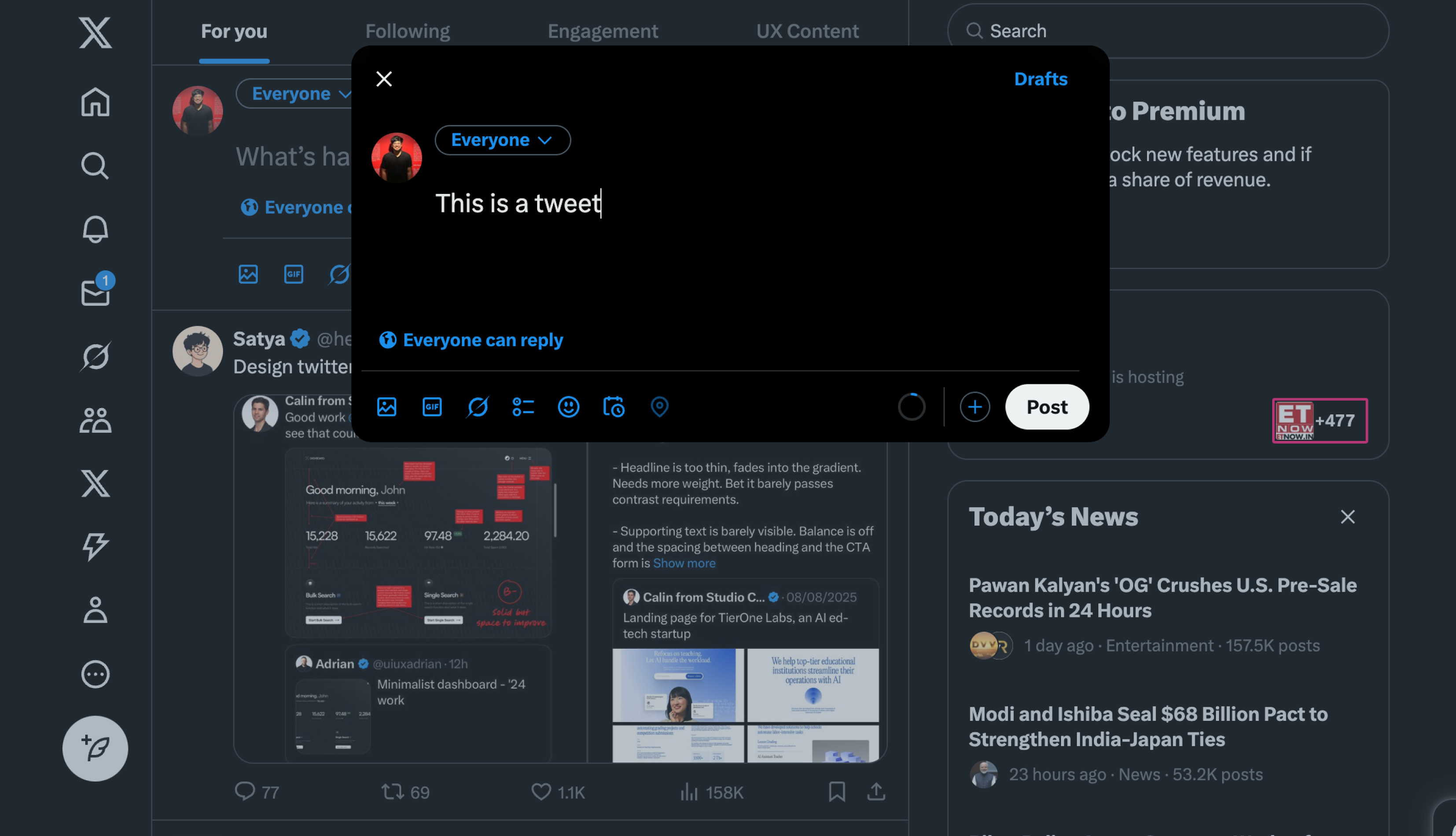
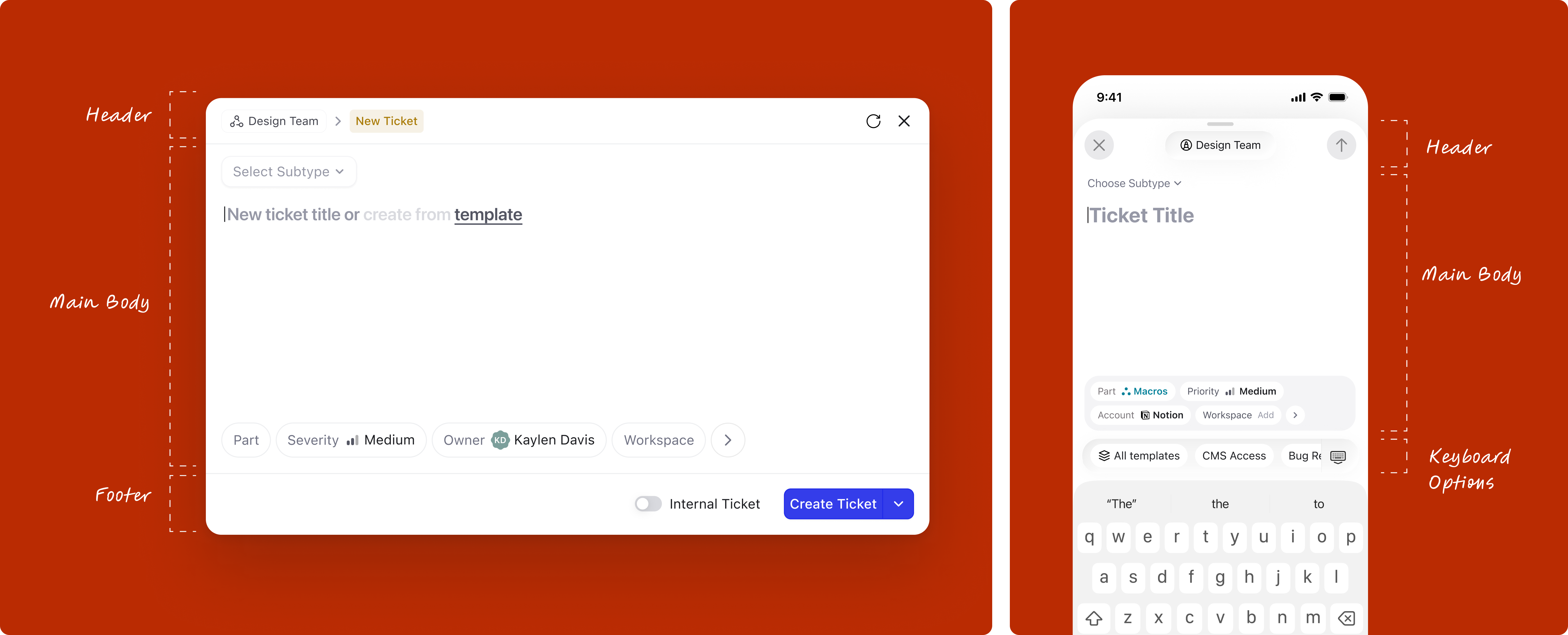
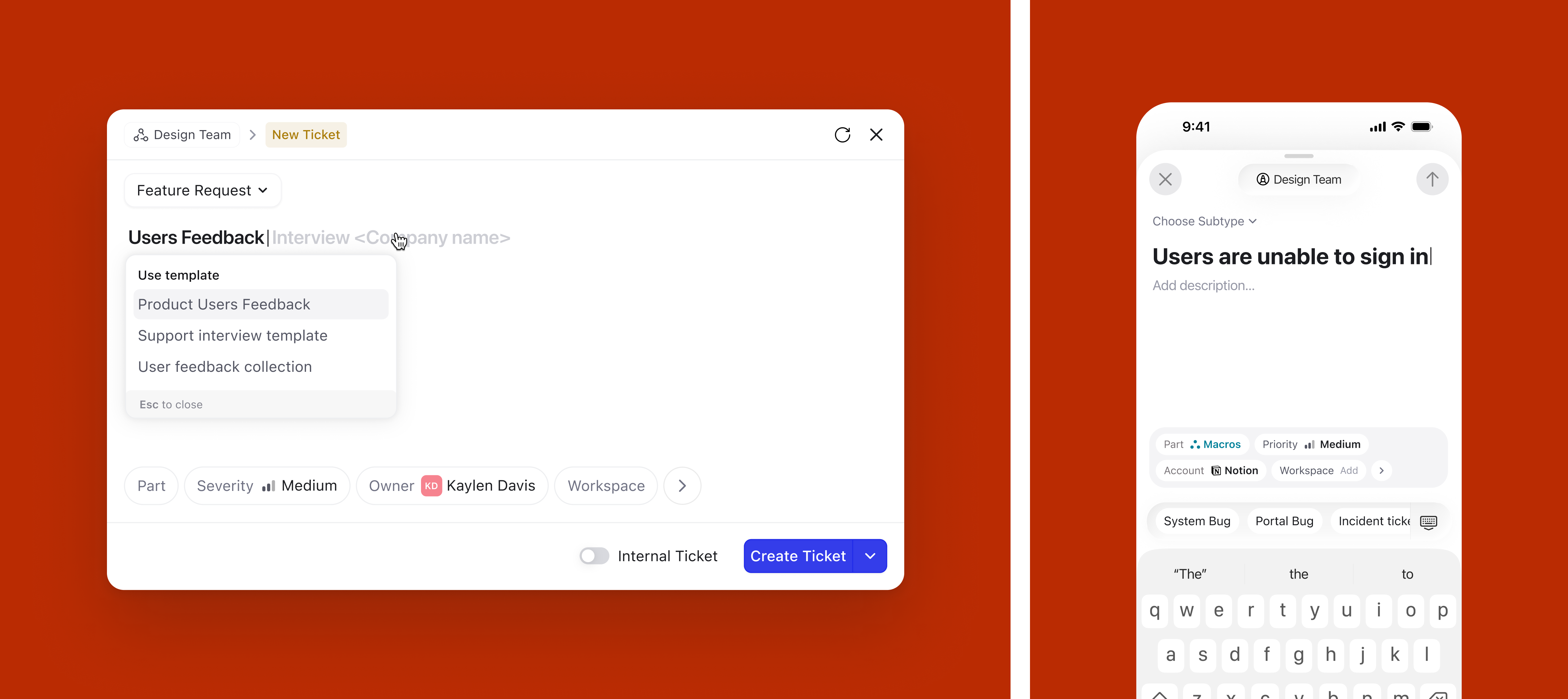
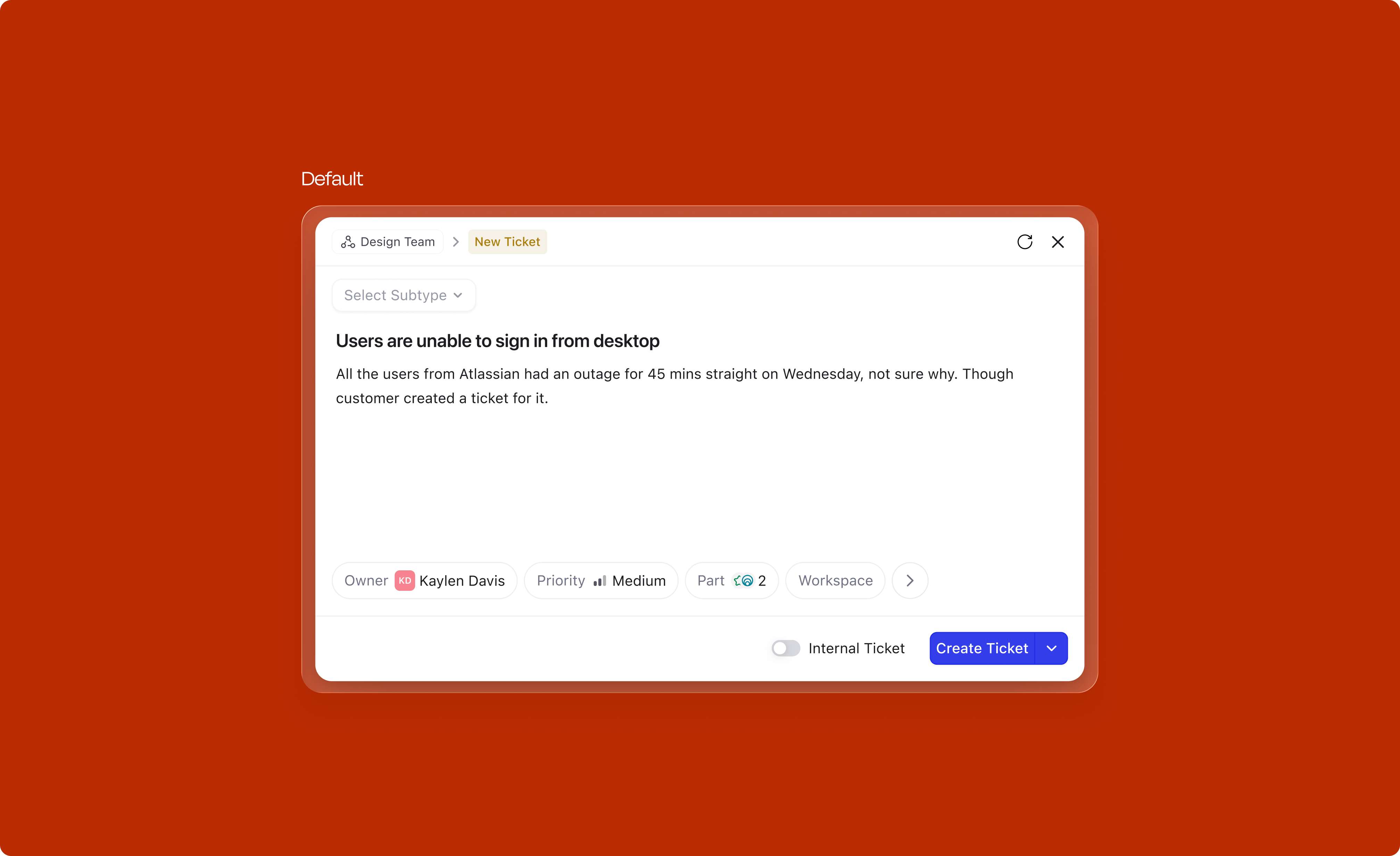
One of the first strategic decisions was the surface itself. Creation is a temporary, focused action. You're not browsing or comparing, you're capturing. A modal centers the user's attention and signals "I'm doing something quick." A side panel, on the other hand, is better suited for persistent viewing, reading a record, referencing details while working.
This distinction seems obvious in hindsight, but the existing product had been using the side panel for everything. Drawing this line gave us a clear design rationale for the switch.
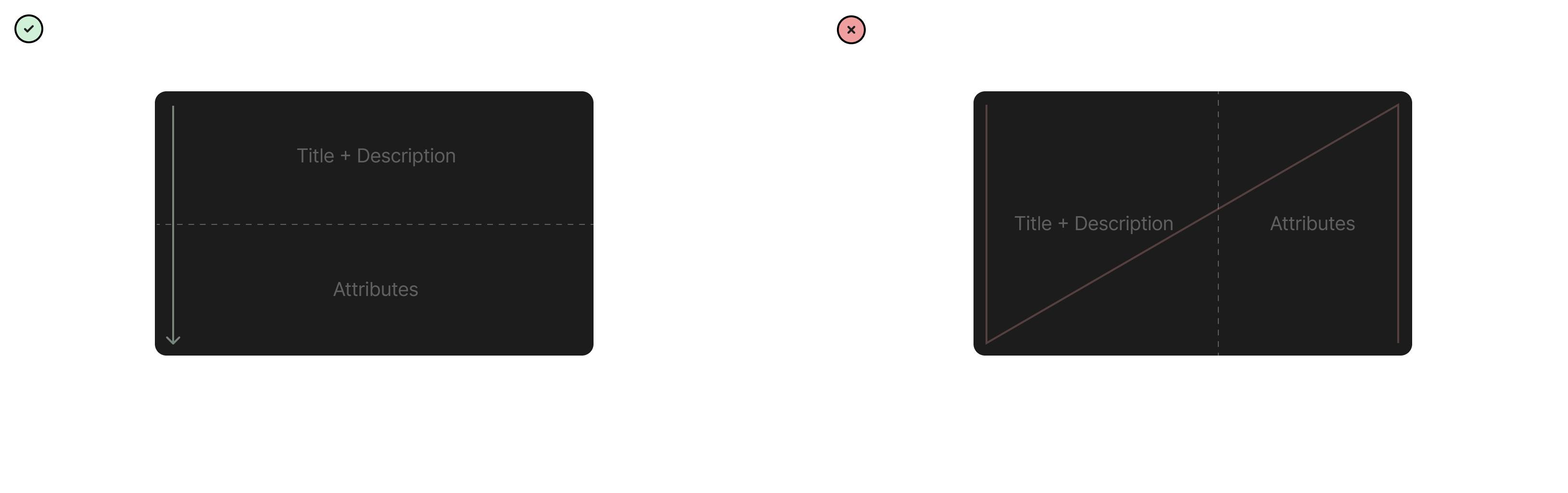
Once the surface was locked in, the next question was the internal layout of the modal itself. Two options were on the table: stacking Title + Description and Attributes as two rows, or placing them side by side as two columns.
The two-row layout won on reading pattern alone. Stacked vertically, the eye travels in a natural L/Z path from the title down through the description and into the attributes, one decision at a time. The two-column layout splits attention across a diagonal N-shaped path, forcing the user to jump between the writing area and the metadata mid-thought. For a focused, capture-first surface, a single top-to-bottom reading line was the right call.
Quick glossary before we get into each decision, since the rest of this section goes element by element.
Before getting to the final anatomy, it's worth showing the path to get there. The modal went through several iterations, each exploring a different arrangement of subtype, title, description, and attributes, trying to balance speed of capture against visibility of metadata. Most fell short: some failed the "reads in one glance" test, others pushed attributes too far below the fold, a few compressed the title so aggressively that templates had nowhere to live.
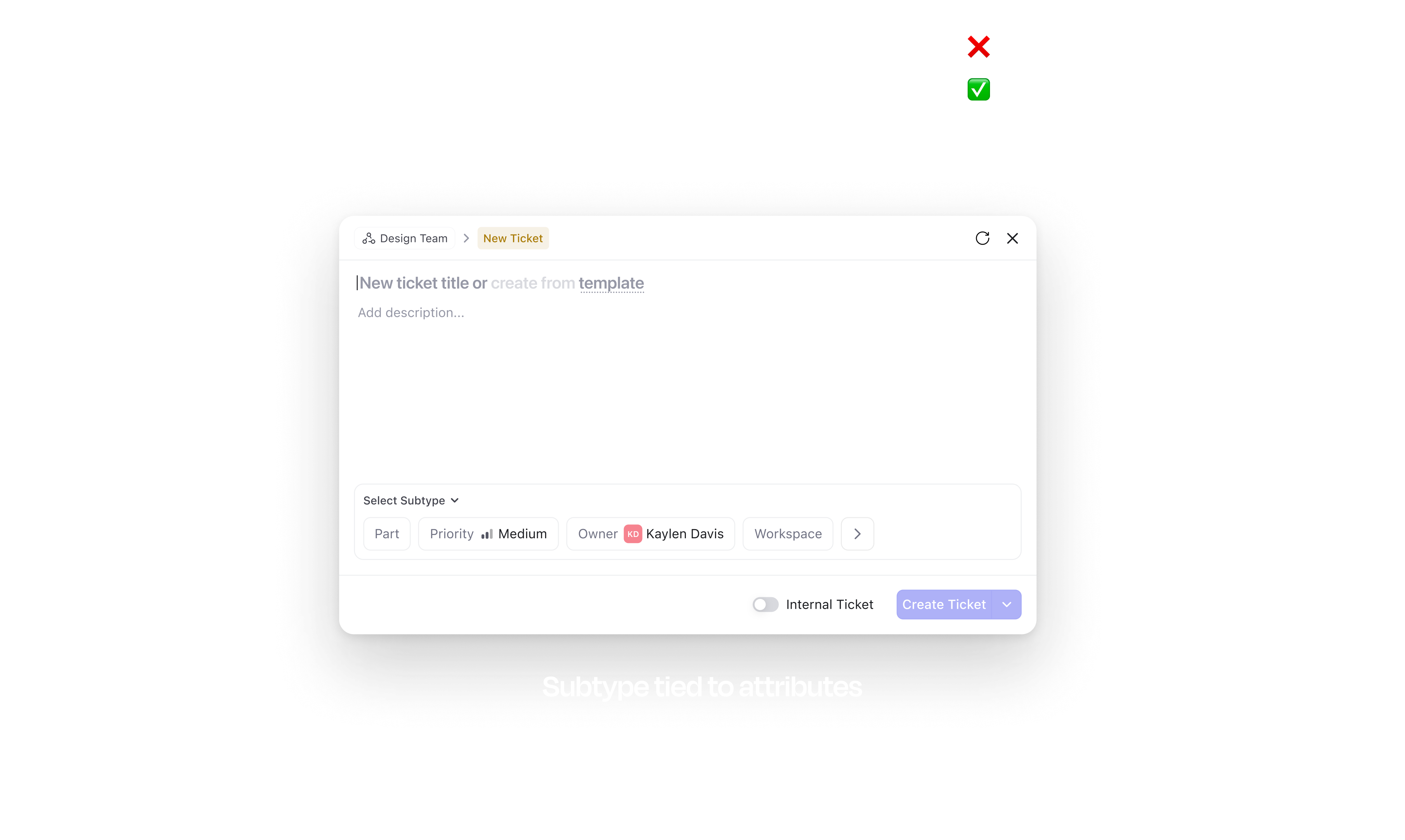
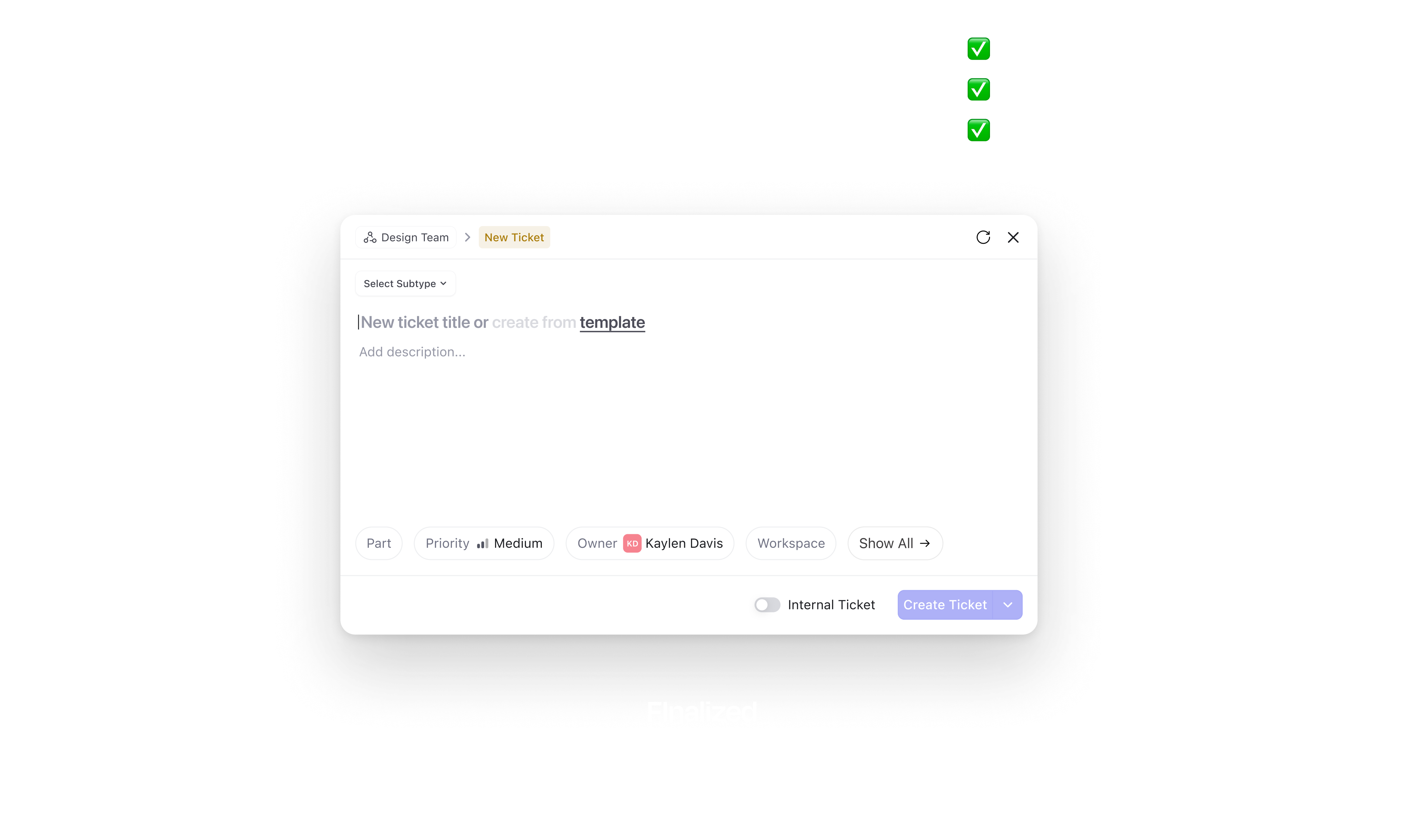
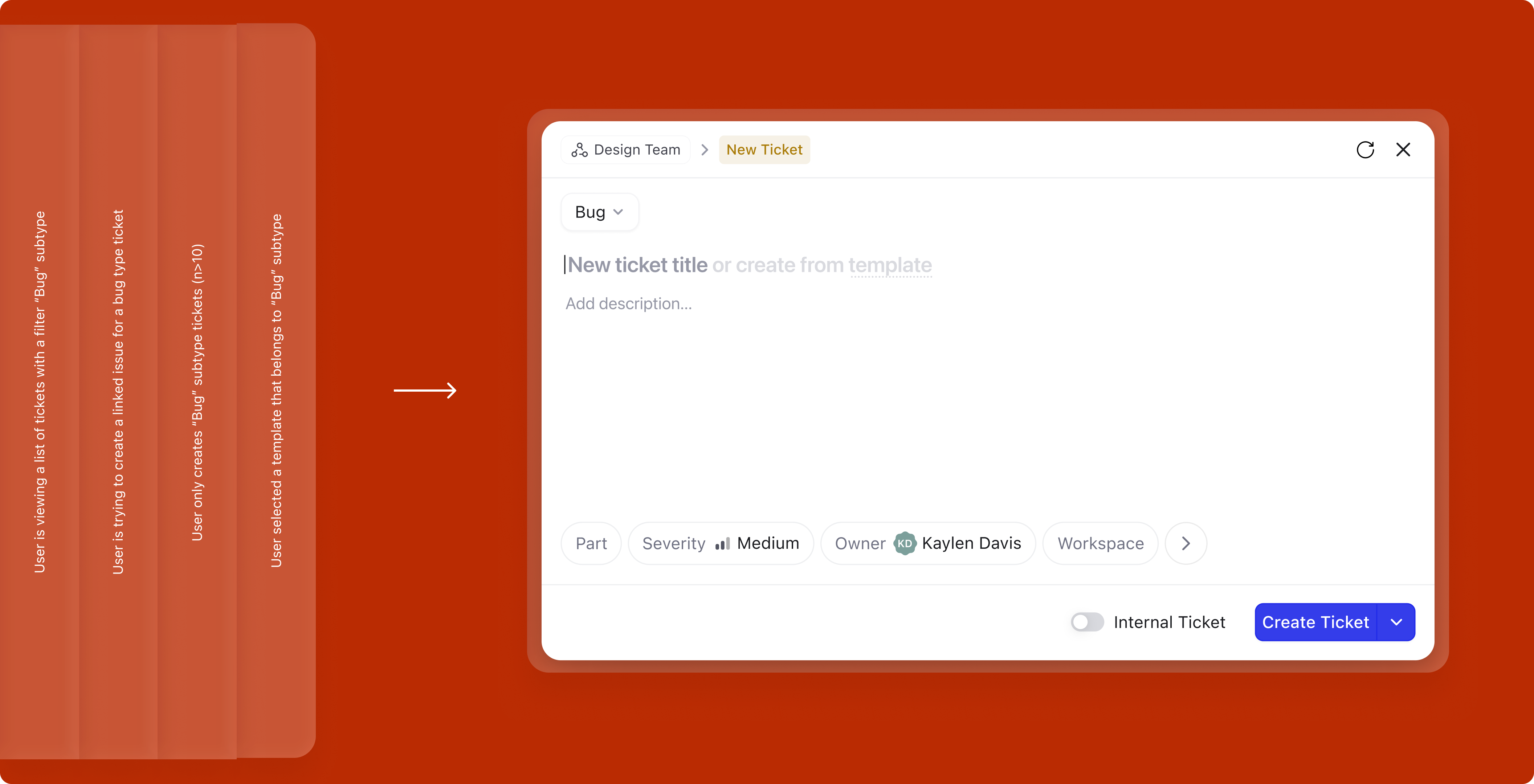
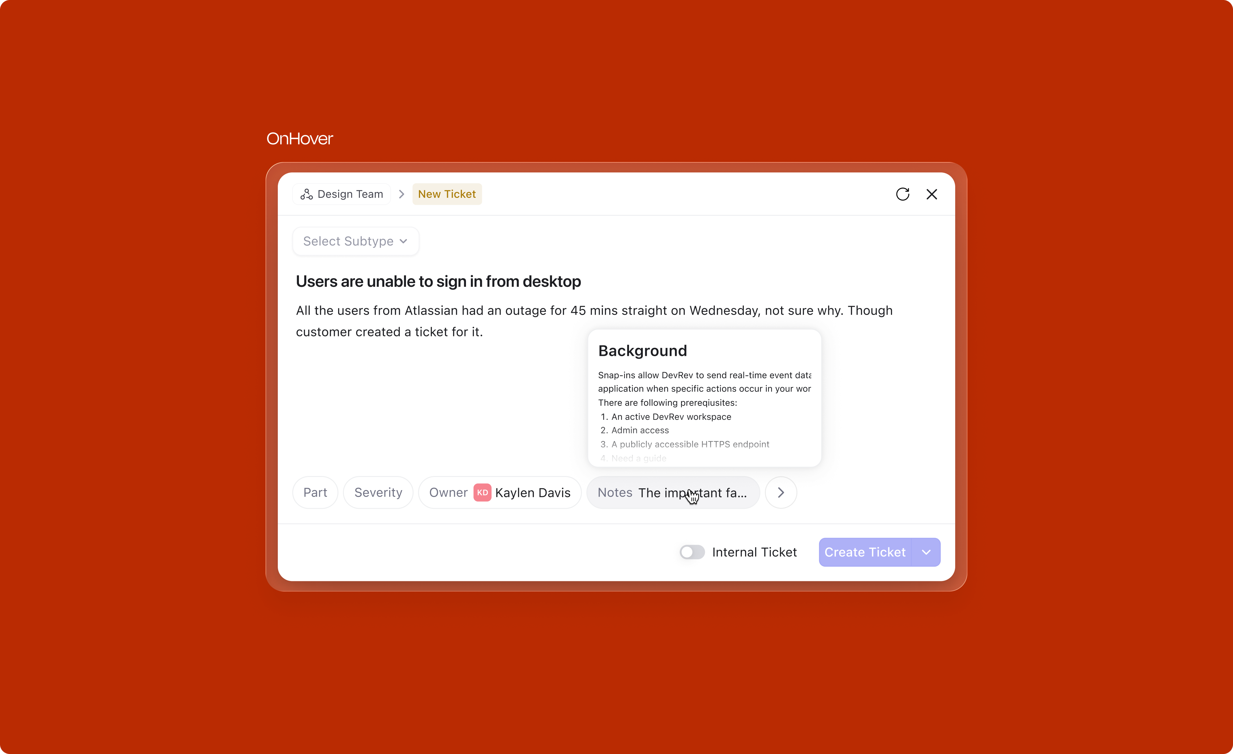
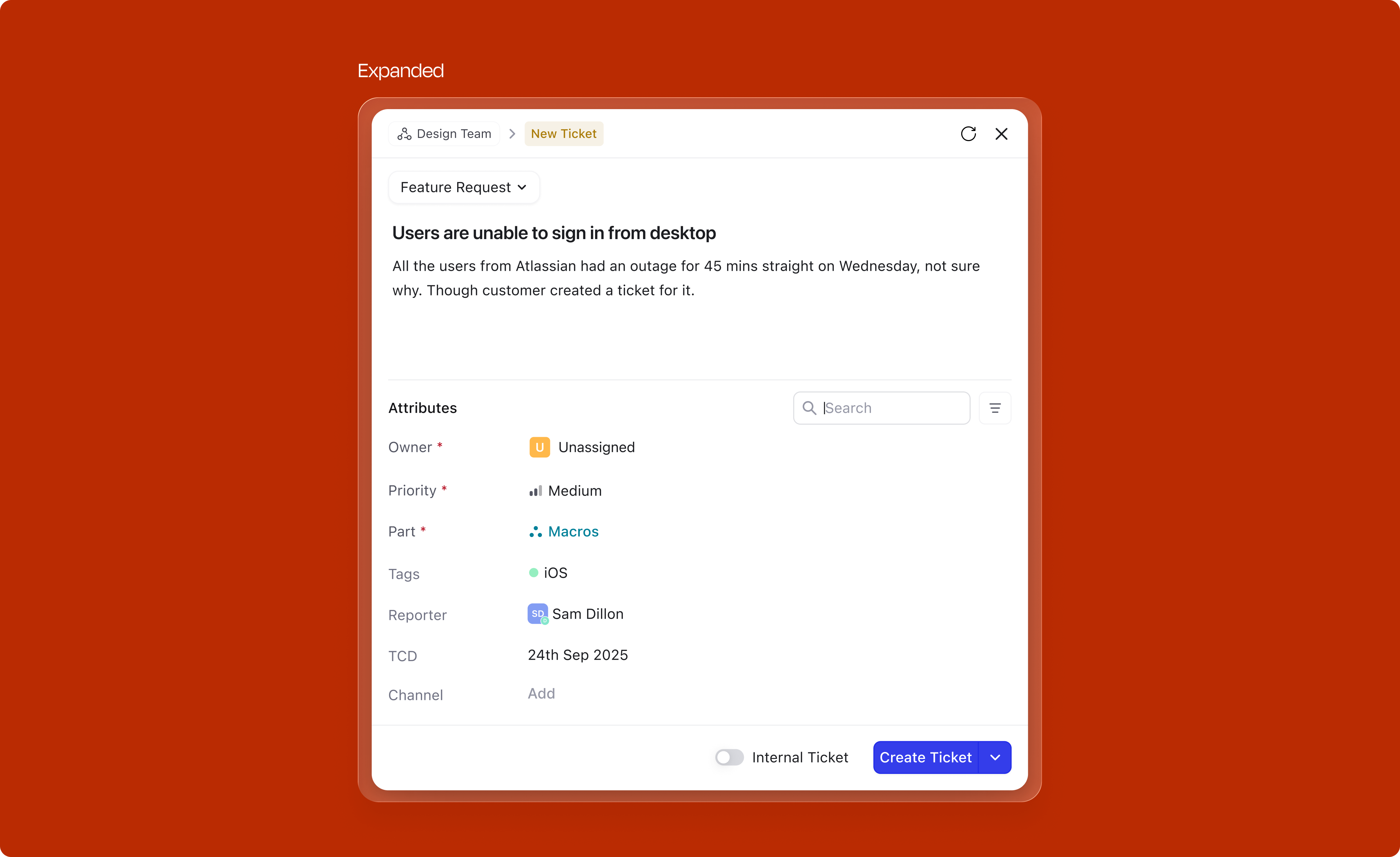
The version below is the one that stuck, the finalized modal. It's split into three zones:
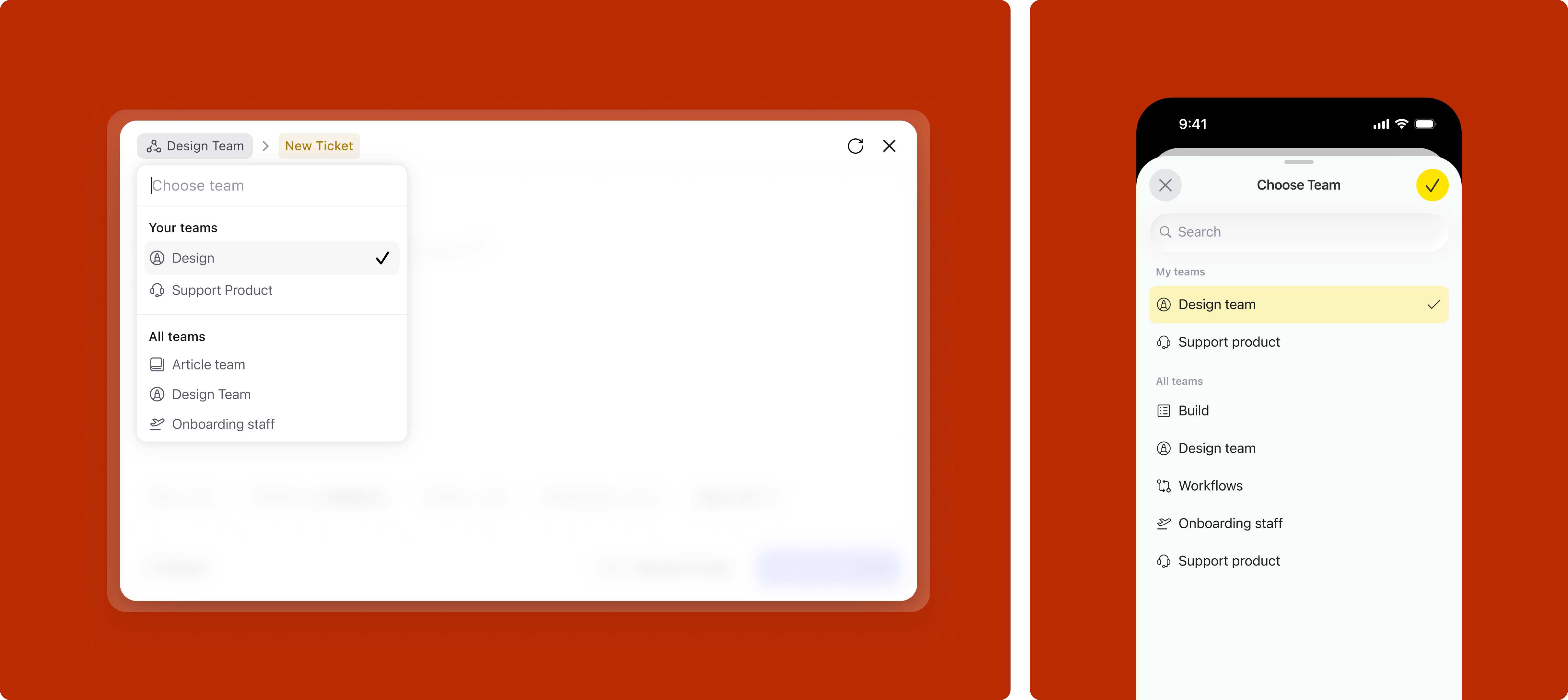
In DevRev, a team is the organizational unit that owns work. Every ticket or issue belongs to a team, and that ownership determines routing, visibility, and who acts on it. Users typically belong to one primary team but often need to log work across several.
This creates a friction point at creation: a user might be browsing one team's view when they need to log something for a different team. Without a switcher in the modal, they'd have to navigate away first, losing context. The team switcher at the top of the modal solves this: the team can be changed without closing the modal or losing what's already been filled in.
For the default value, two cases were designed:
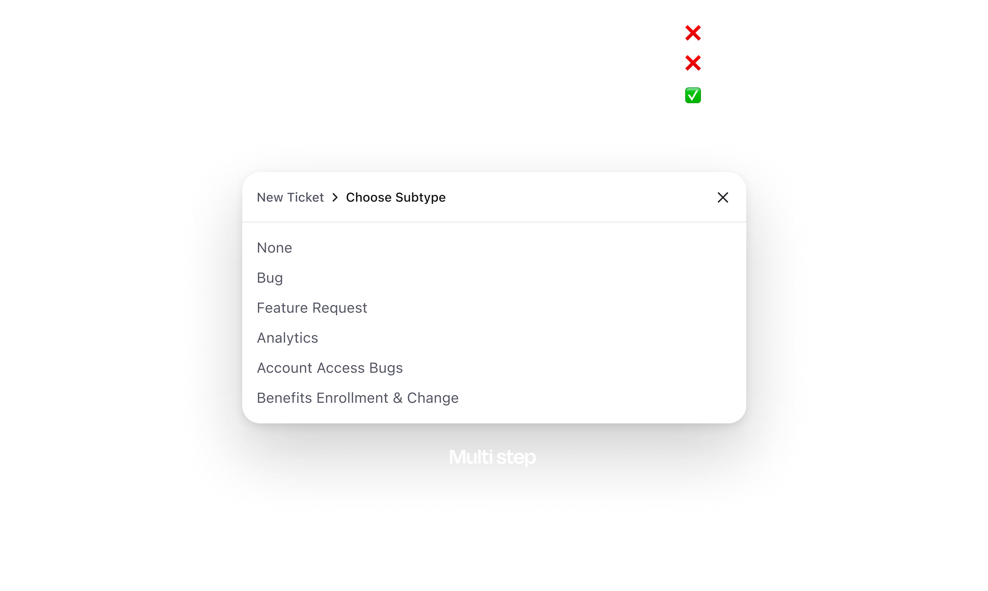
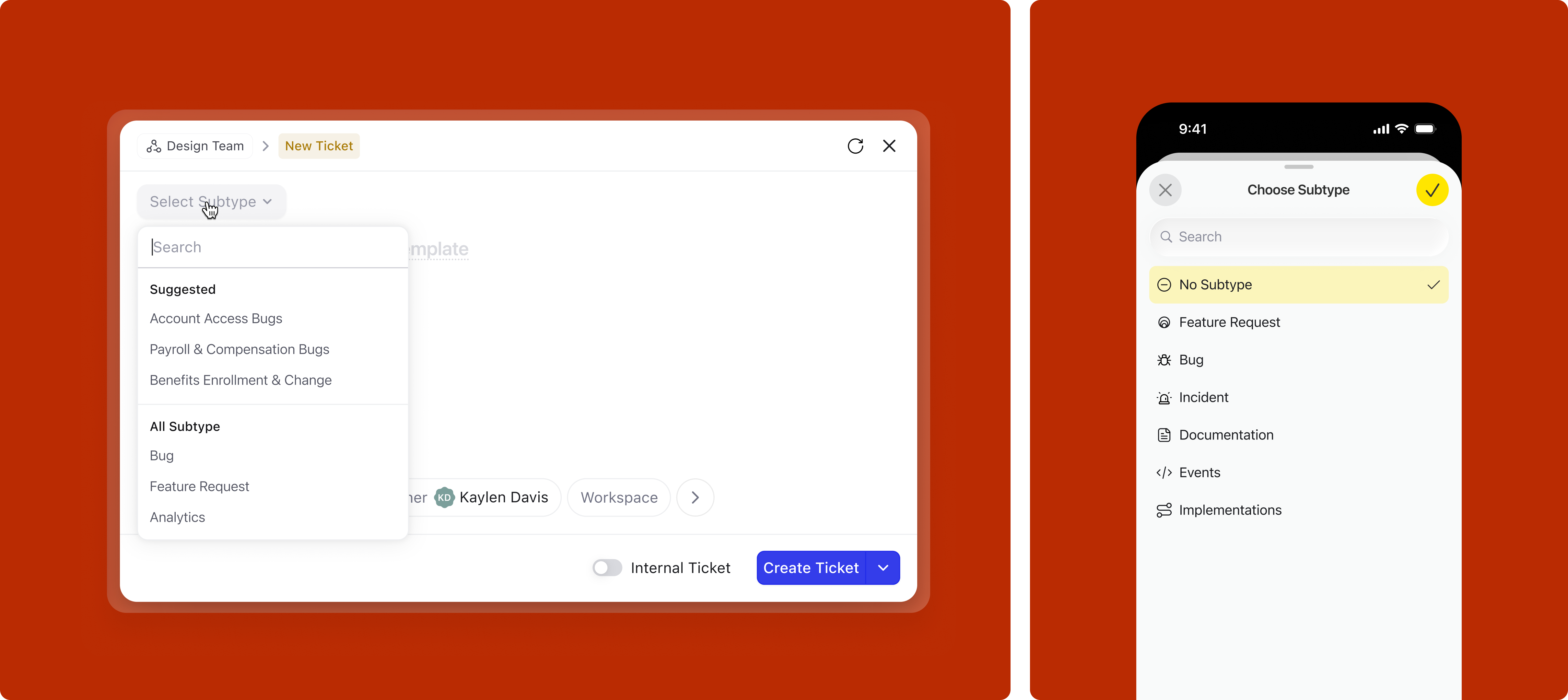
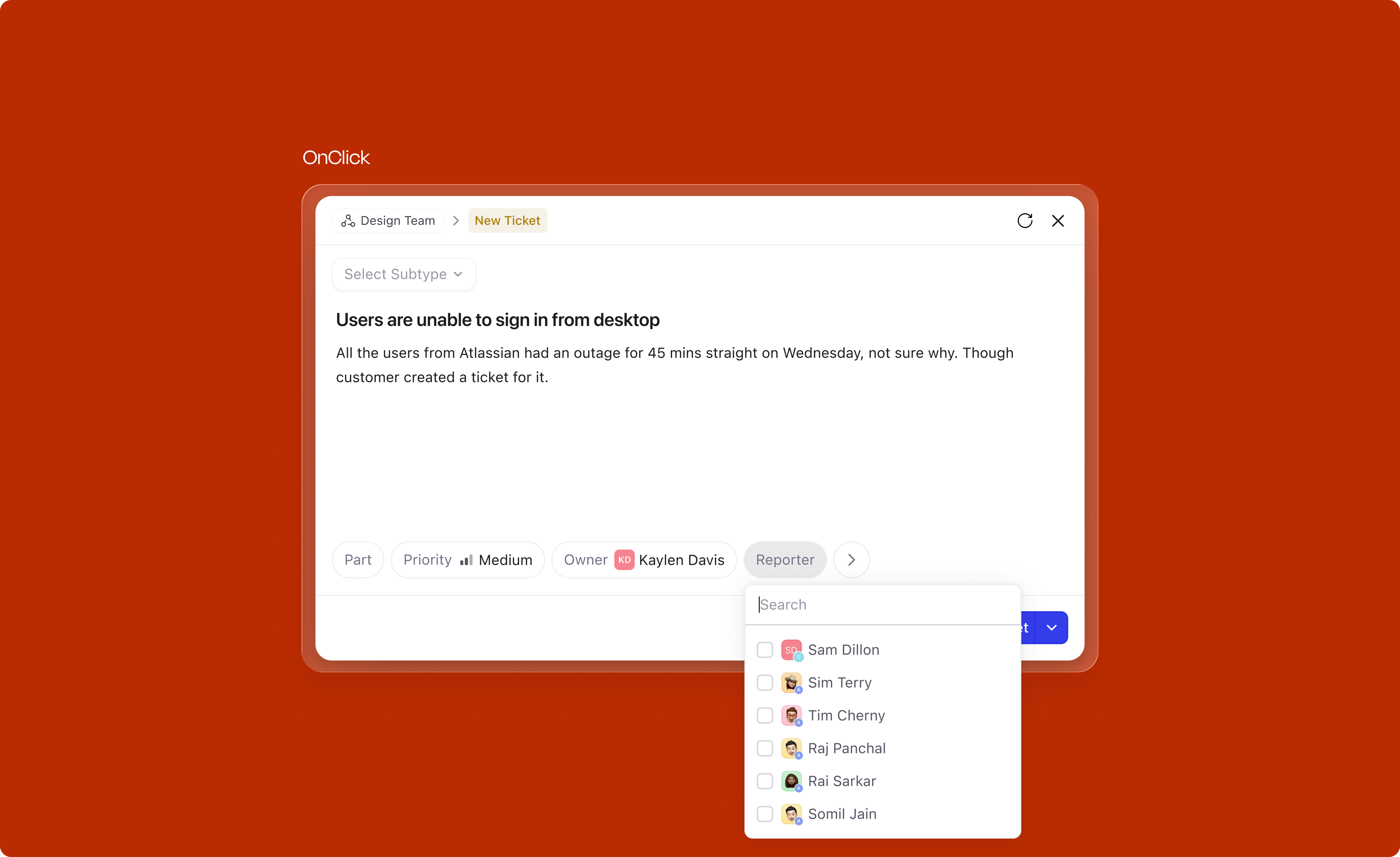
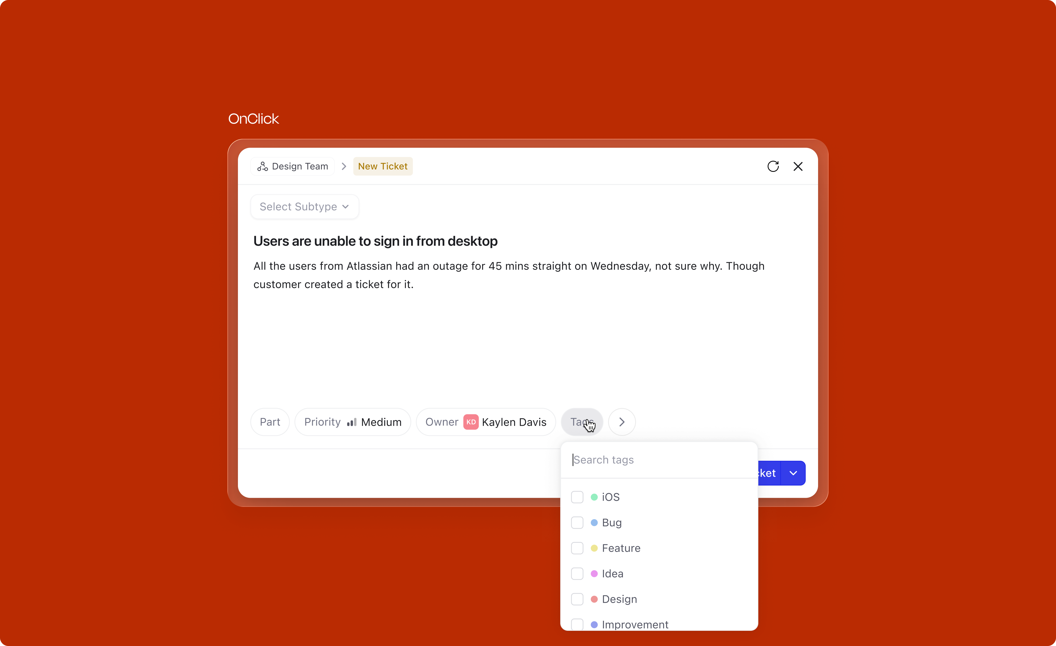
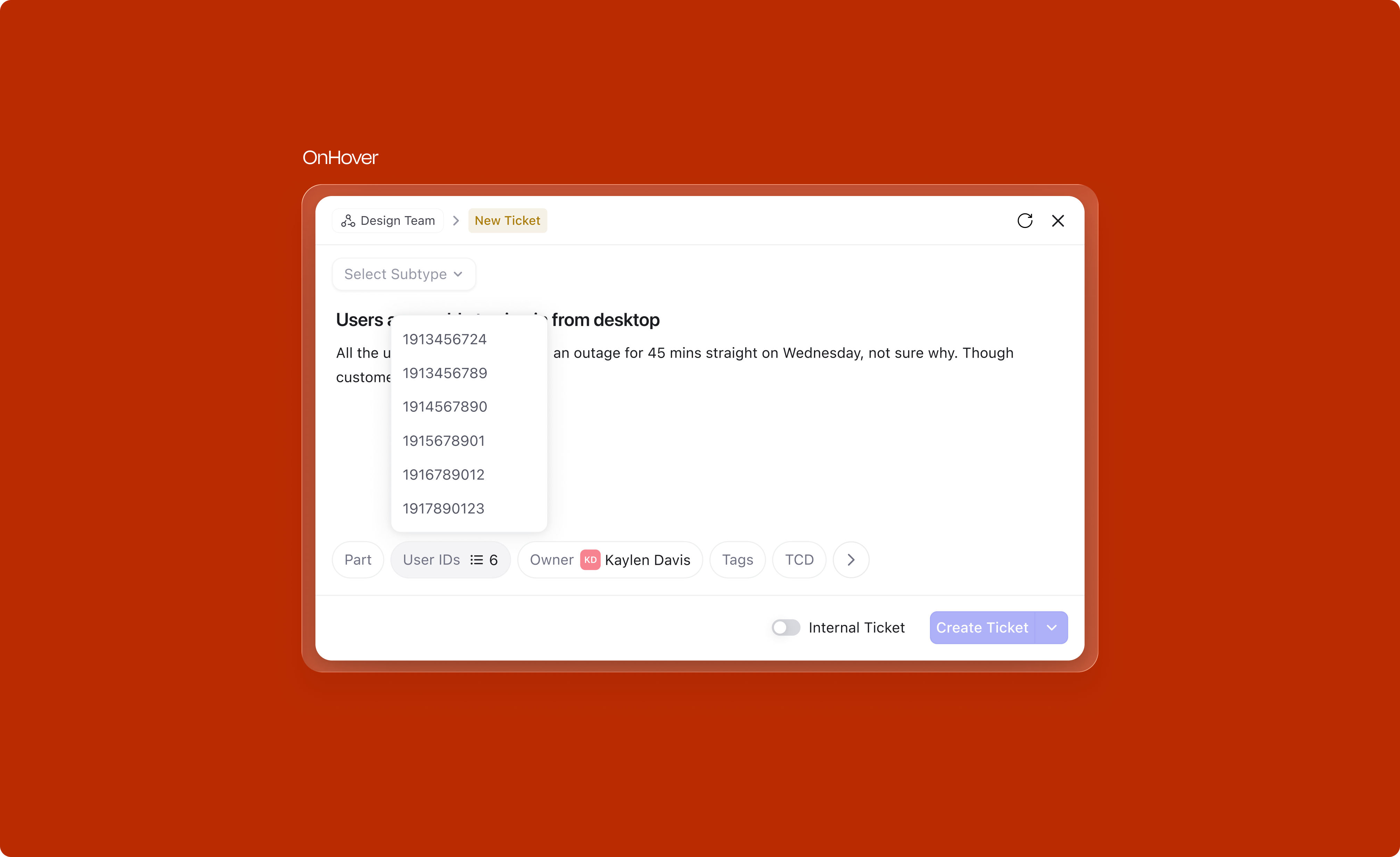
Subtypes (Bug, Feature Request, Data Sync Request, etc.) are crucial for routing work after creation. Each subtype has its own fields, mandatory requirements, and recommended templates. Yet in the old design, subtype selection was tucked into the header where users consistently missed it.
In our research, we found that a lot of users missed adding the subtype since it was situated in the header. We wanted to make sure it grabs enough user attention and comes in the reading path.
The subtype selector was moved into the main body of the modal, right at the top of the reading path, before the title field. The default value and dropdown behaviour depends on context:
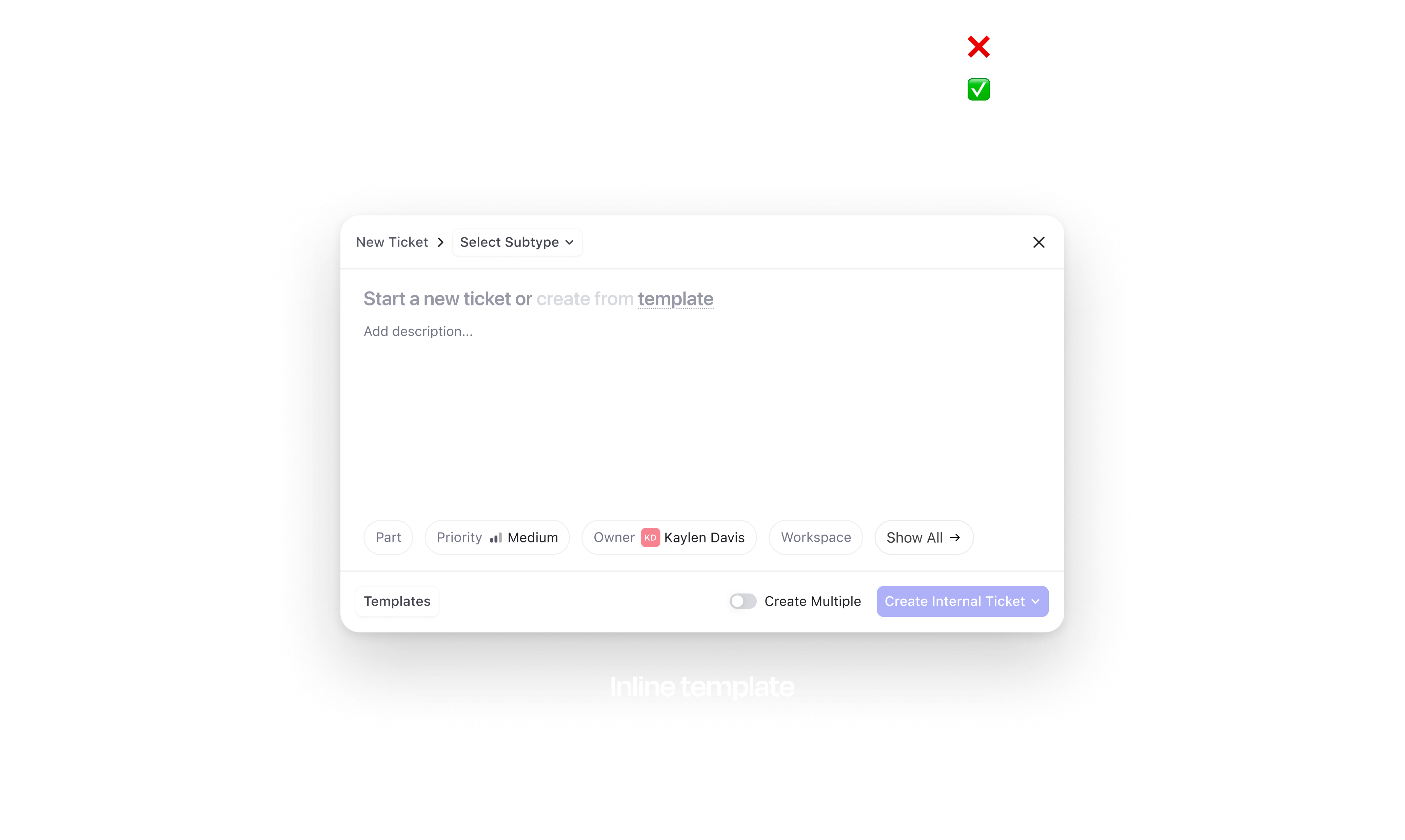
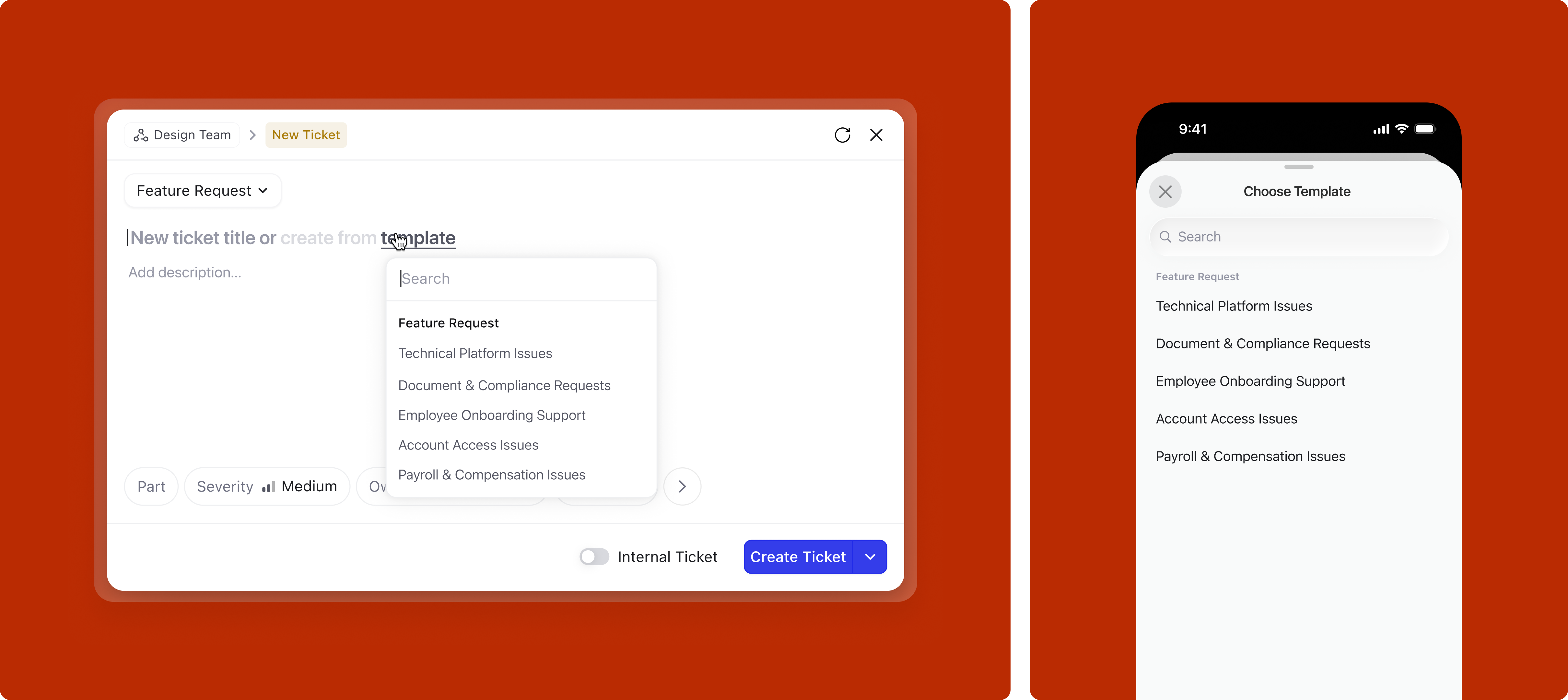
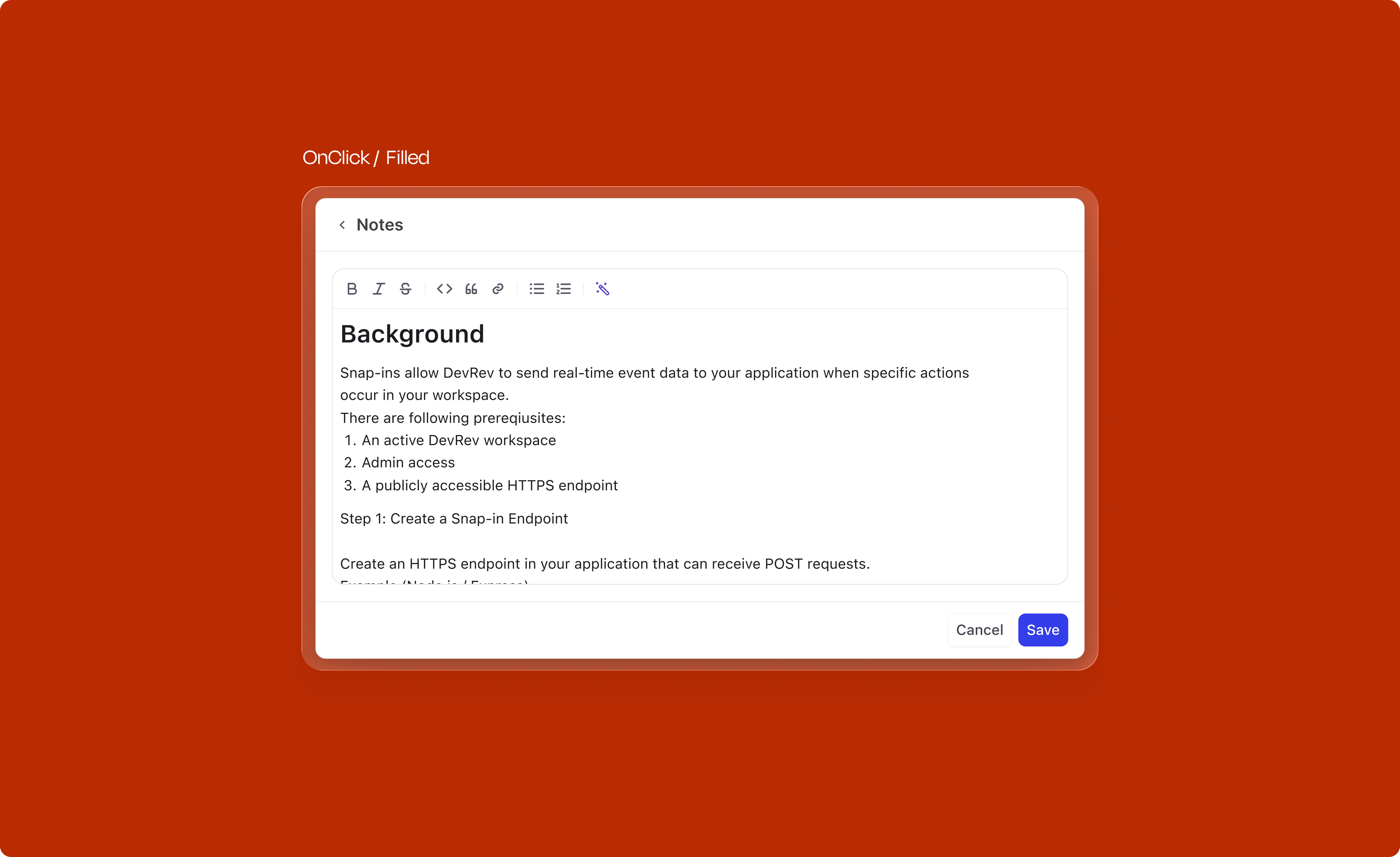
Templates are a powerful way to speed up creation. They pre-fill the description with a structured format relevant to the subtype. But templates were essentially invisible in the old flow. In the new design, they surface at two moments.
Right from the title area, before writing anything, the user can open the template picker. What they see depends on whether a subtype is already selected: if it is, the picker shows only templates for that subtype by default, but searching surfaces everything under an "All templates" group. If no subtype is selected, last-used templates appear first, followed by all templates organized by category.
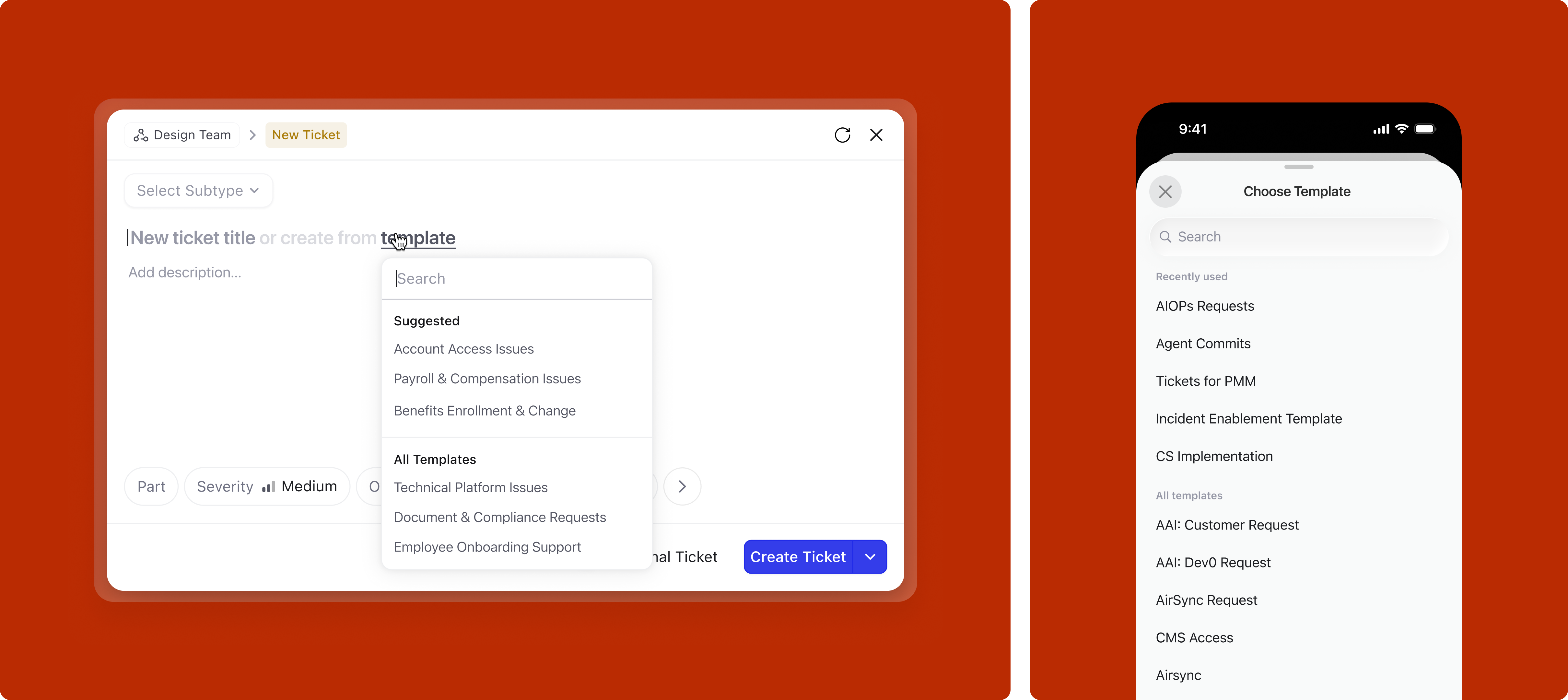
If the user bypasses the picker and writes directly in the title, the system may nudge a relevant template based on the selected subtype, but only when the match is confident enough to be useful rather than distracting. On mobile, the quick keyboard toolbar shows relevant templates for one-tap application.
Applying a template overrides all previously set defaults. Templates represent an org-level intent: a structured format with pre-configured attributes that the organization has decided is the right starting point. When a user picks a template, they are opting into that intent, so the system respects it fully rather than merging it with other defaults.
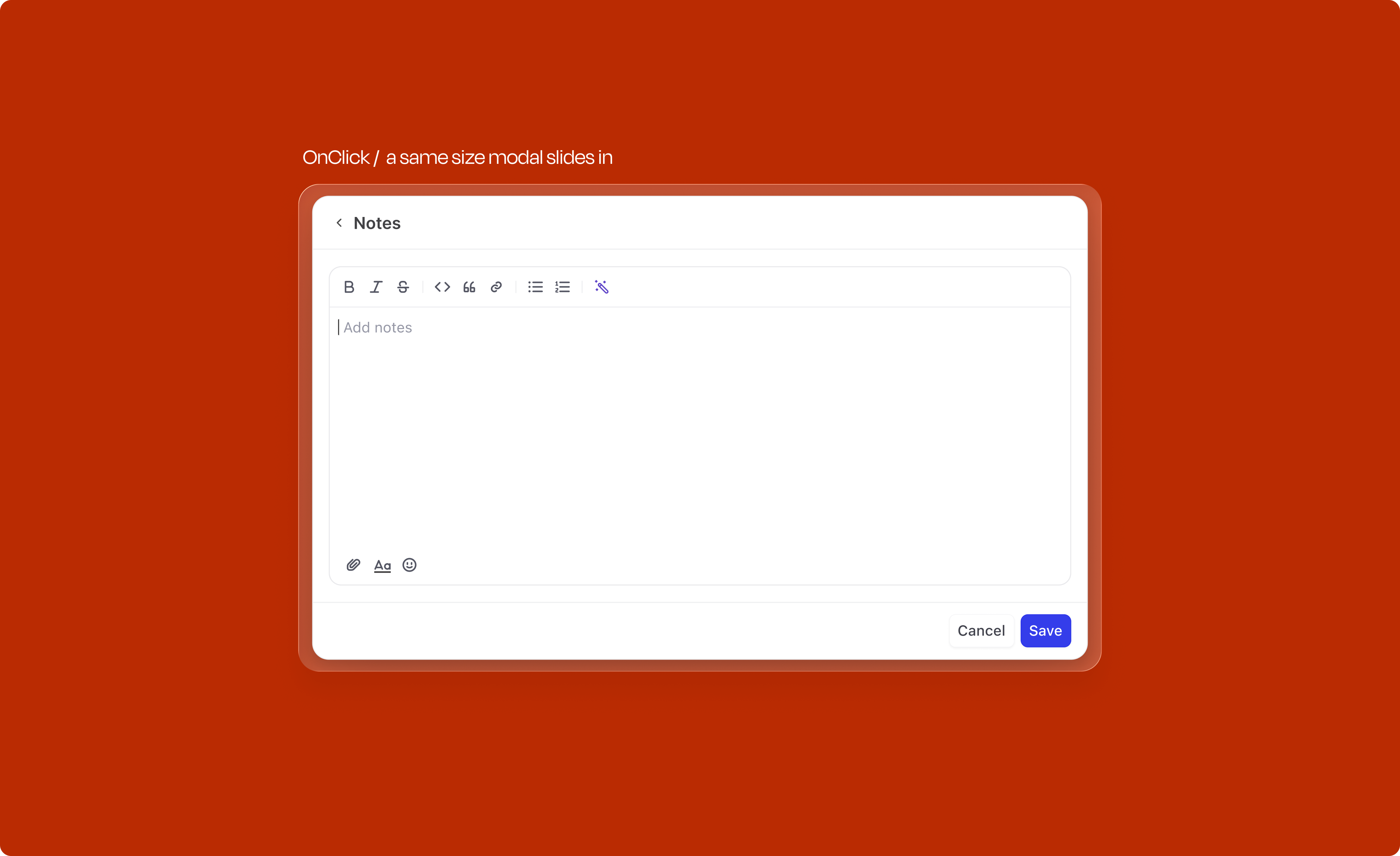
The description field needed to balance two tensions: compact enough to feel quick, but generous enough when someone needs to write more. The text area expands progressively up to 356px, after which it scrolls. Quick actions for attachments and emoji sit alongside without cluttering the default state.
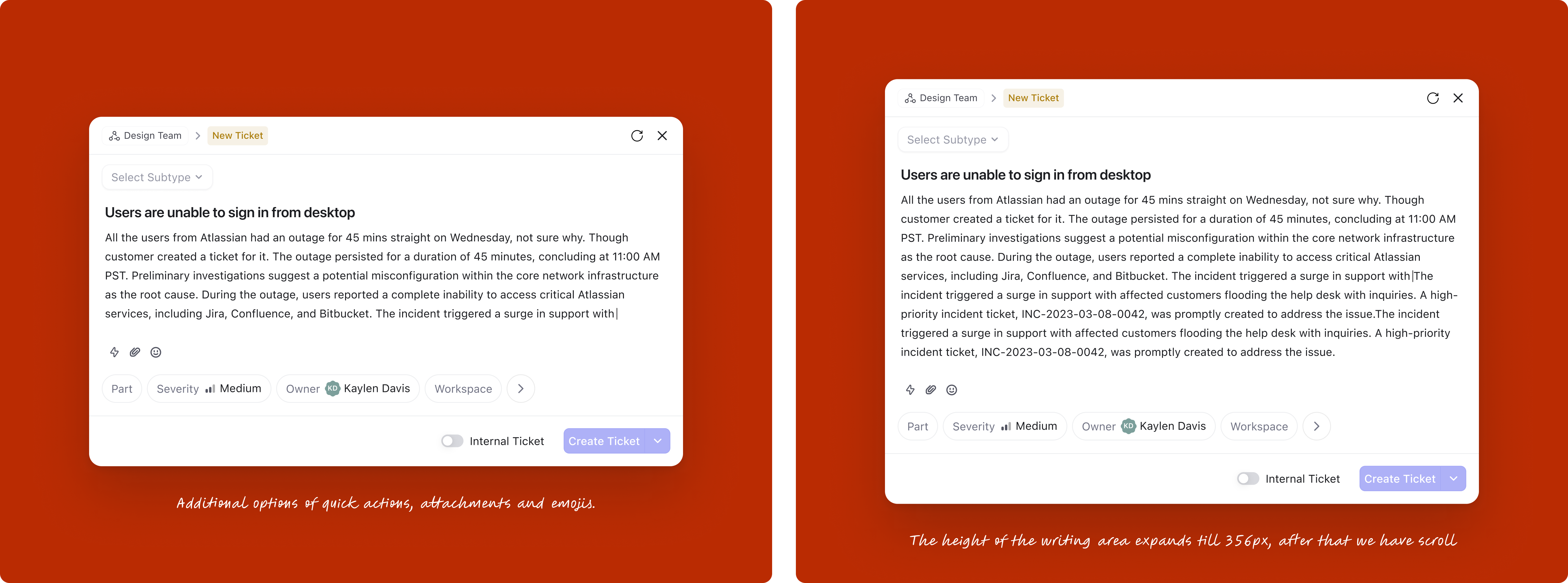
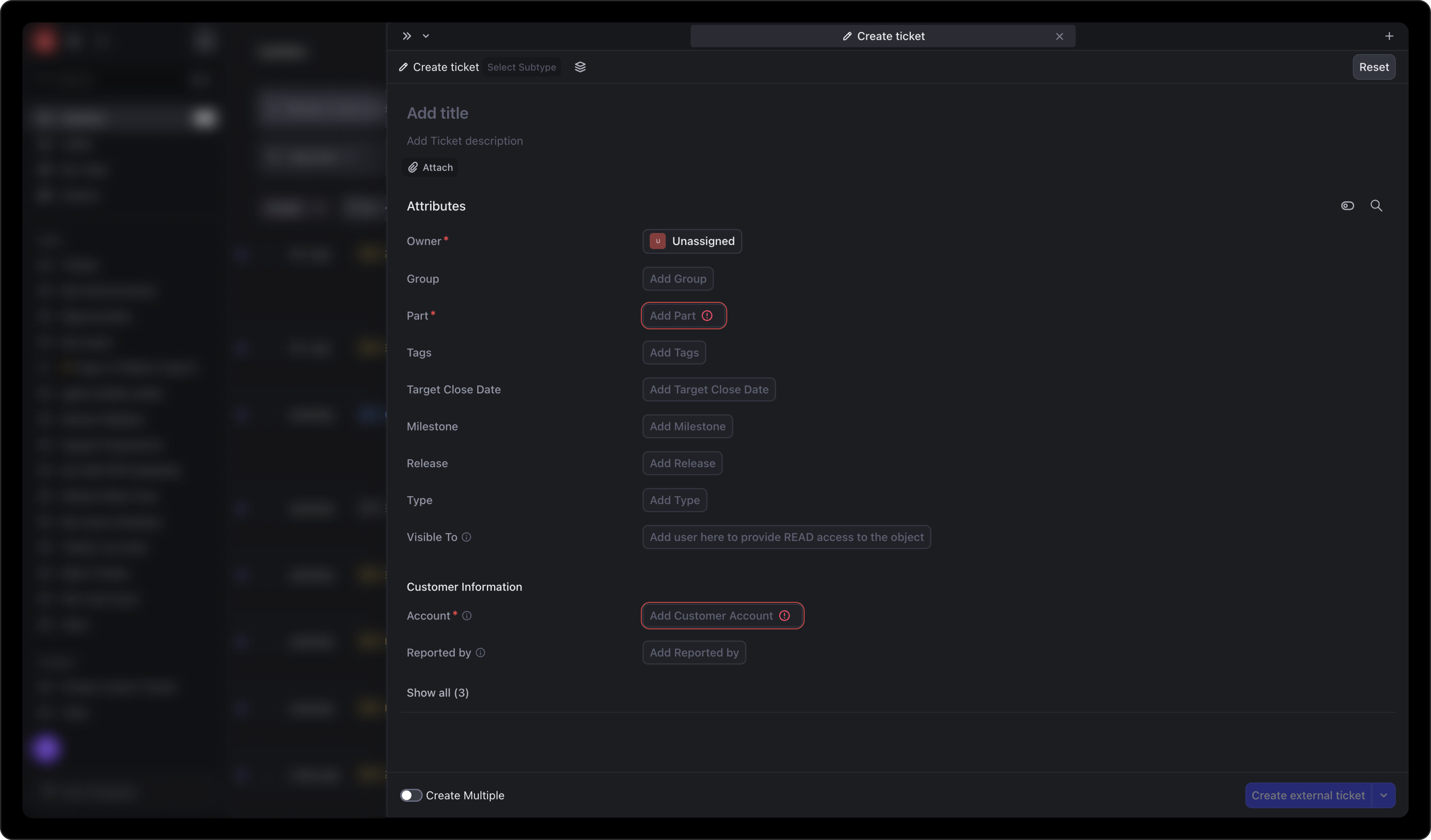
This was one of the most impactful changes. Organizations using DevRev often have over 50 fields on tickets and issues, yet on average only 4 fields are mandatory. The old design let admins toggle "show in creation" for any field, which led to bloated creation forms where users couldn't distinguish required from optional.
This makes it super difficult for users to find all mandatory fields before the button becomes active, hence delaying the whole process. This is one of the things contributing to the hard learning curve of DevRev.
The fix: remove the admin-side "show in creation" toggle entirely. Instead, the attribute tray now intelligently surfaces fields based on four distinct sources, with a clear prioritization hierarchy:
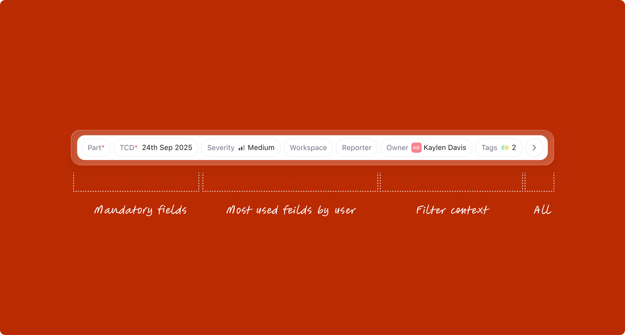
1. Mandatory attributes
All required fields for the selected work type always appear. These are non-negotiable; the user cannot submit until these are filled.
2. Contextual attributes from list filters
When the creation modal is opened from a filtered list view, those filter values automatically appear as pre-filled attributes. For example, if the user opens "Create" from a list filtered to "Priority: High" and "Assignee: Sarah", those fields surface in the modal with values already set. This contextual awareness eliminates redundant data entry.
3. Most-used attributes
The system tracks which fields this user (or team) fills most frequently, and surfaces the top candidates that aren't already shown from sources 1 and 2. This learns from behavior and adapts to each user's workflow.
Note: when a template is applied, it takes priority and overrides all of the above. This prioritization reduces cognitive load: users see only what matters for their context.
Attribute filling was redesigned in four progressive layers, each building on the last.
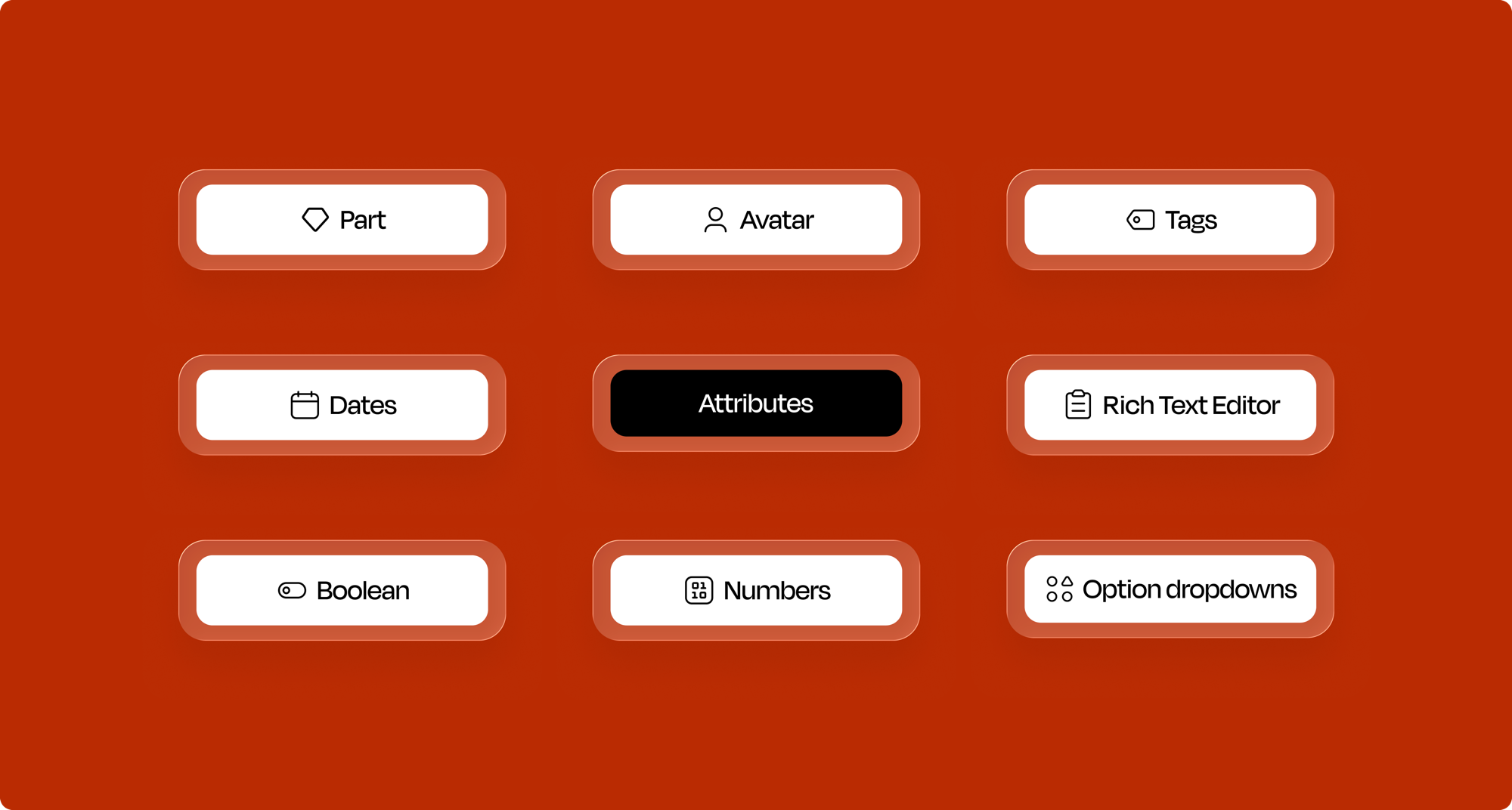
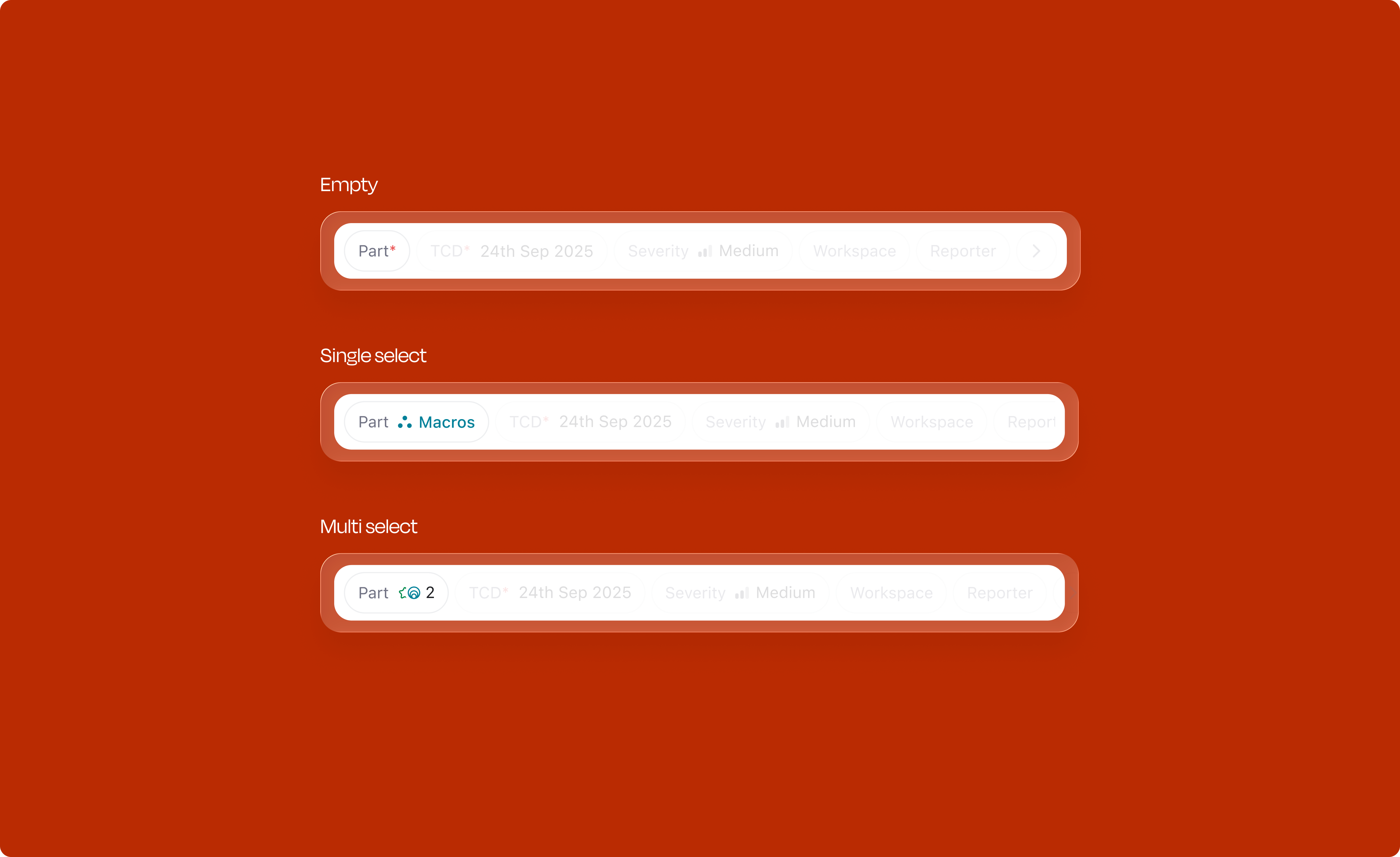
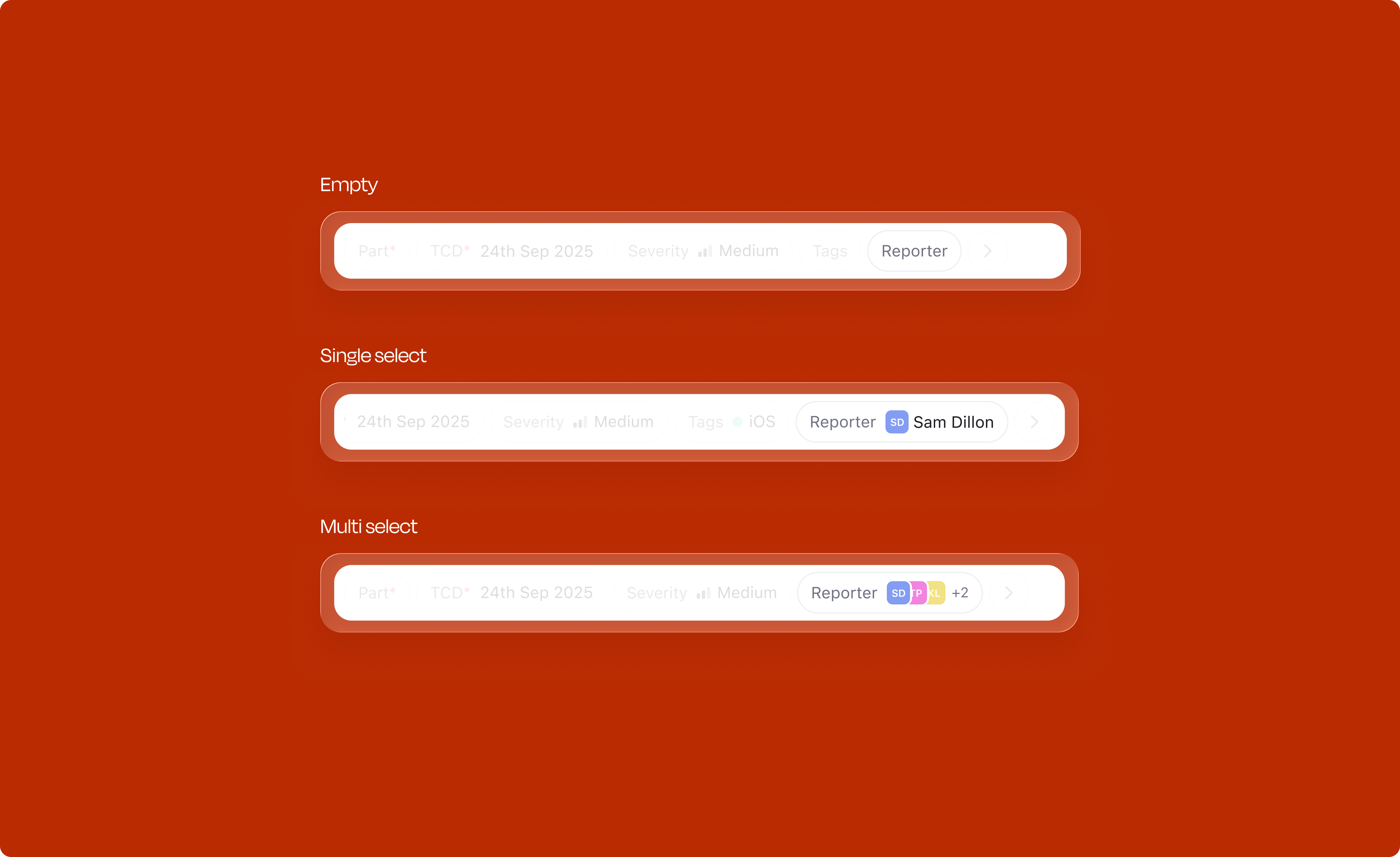
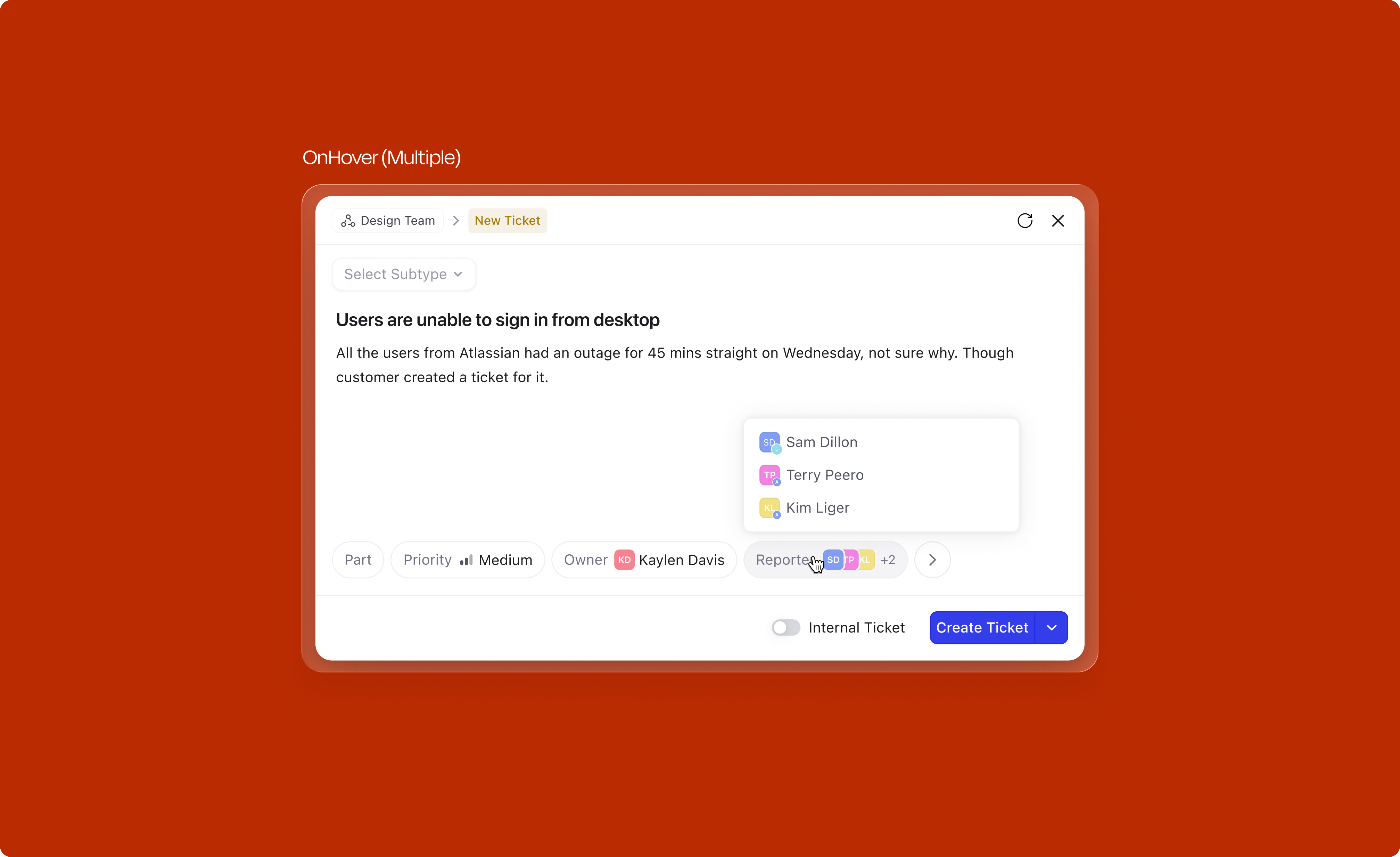
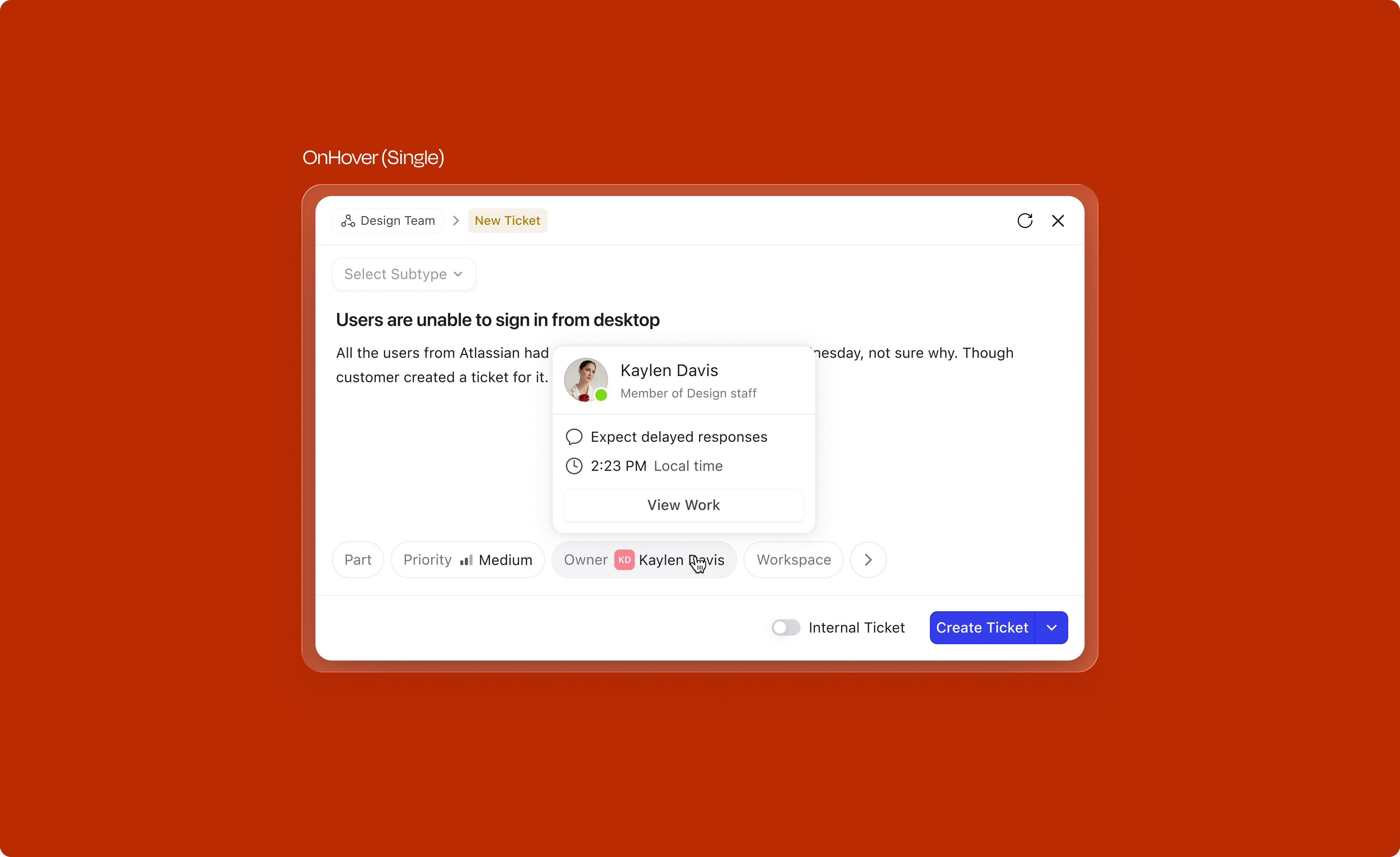
Each attribute type has its own interaction pattern, optimized for the kind of data it captures. Each comes with carefully designed states for selection, rollover, and deselection.
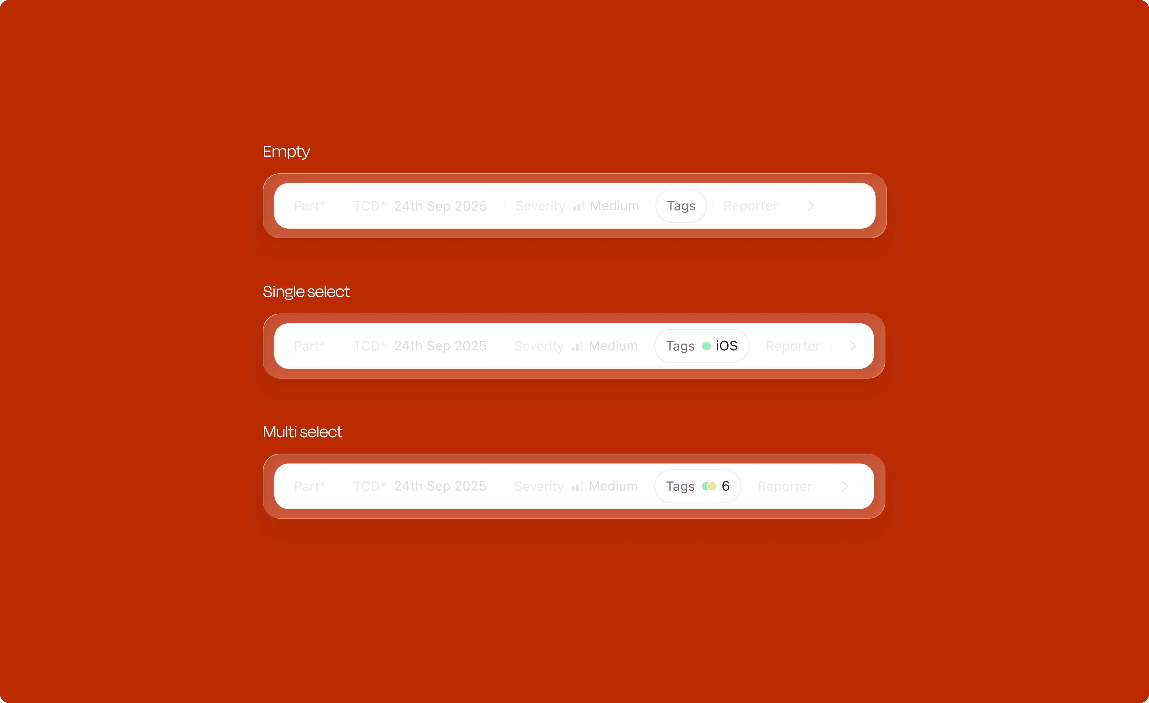
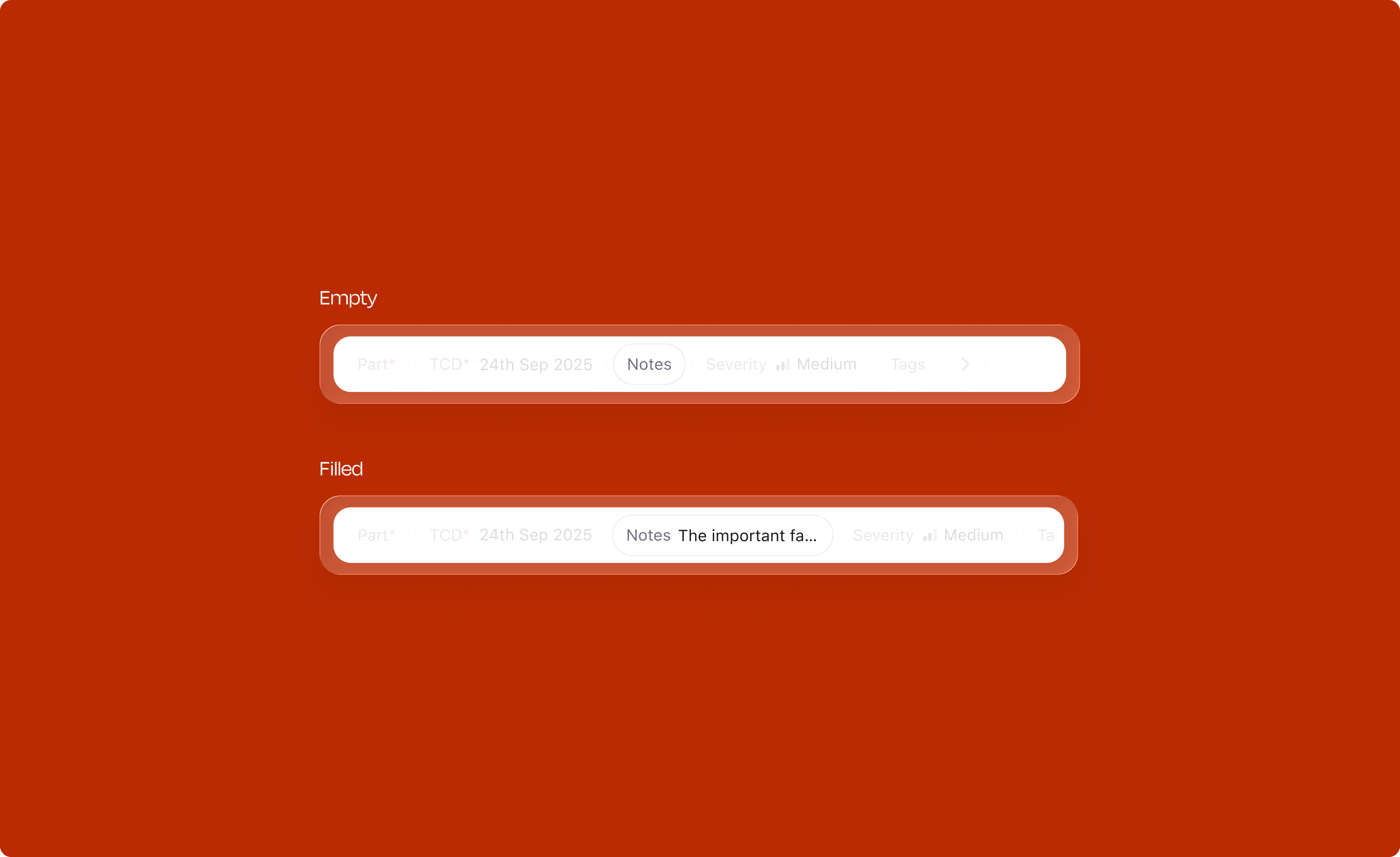
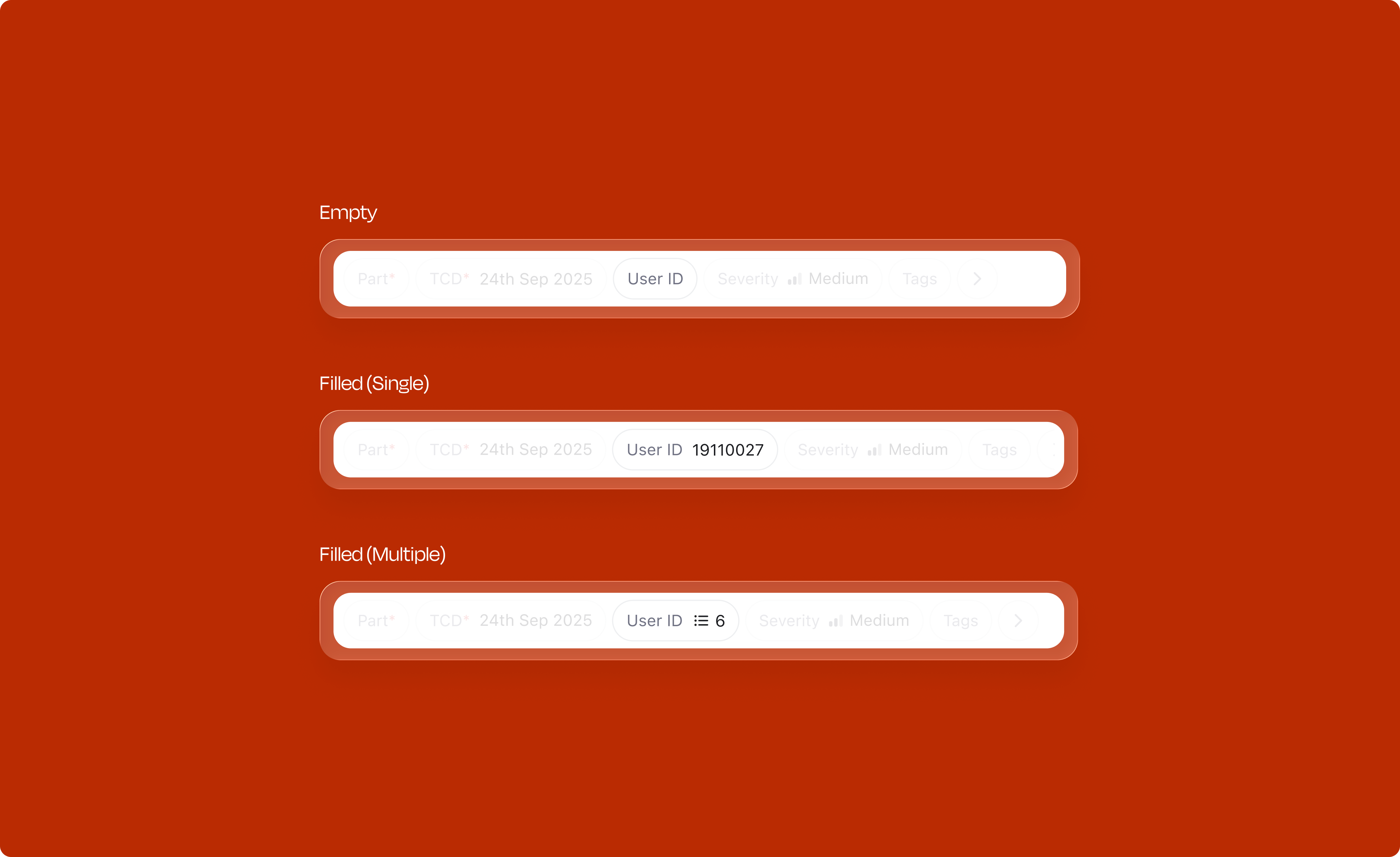

The interaction pattern stays the same across all eight types: hover reveals detail, selected items have weight, and one click deselects. Learn it once, it works everywhere.
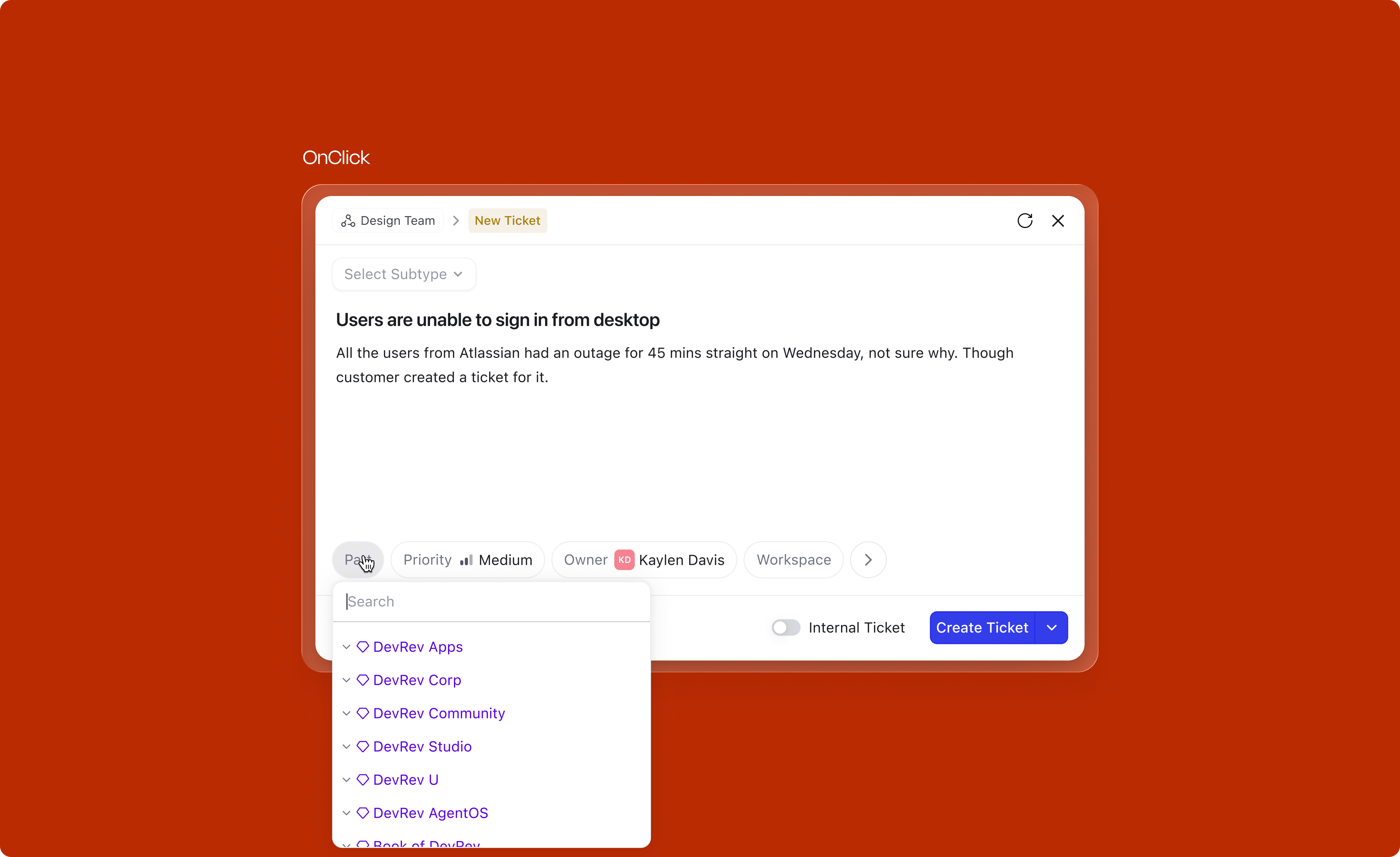
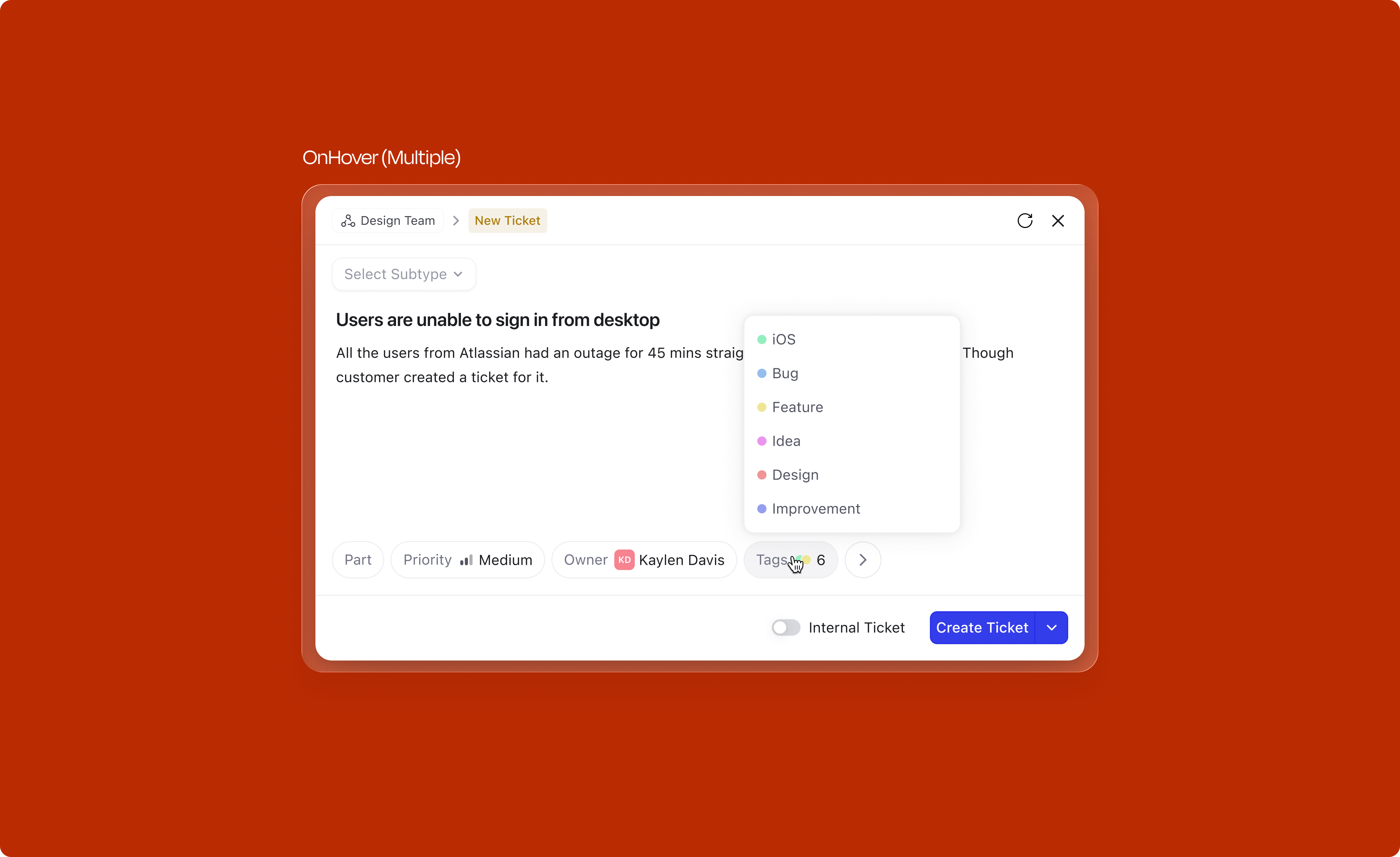
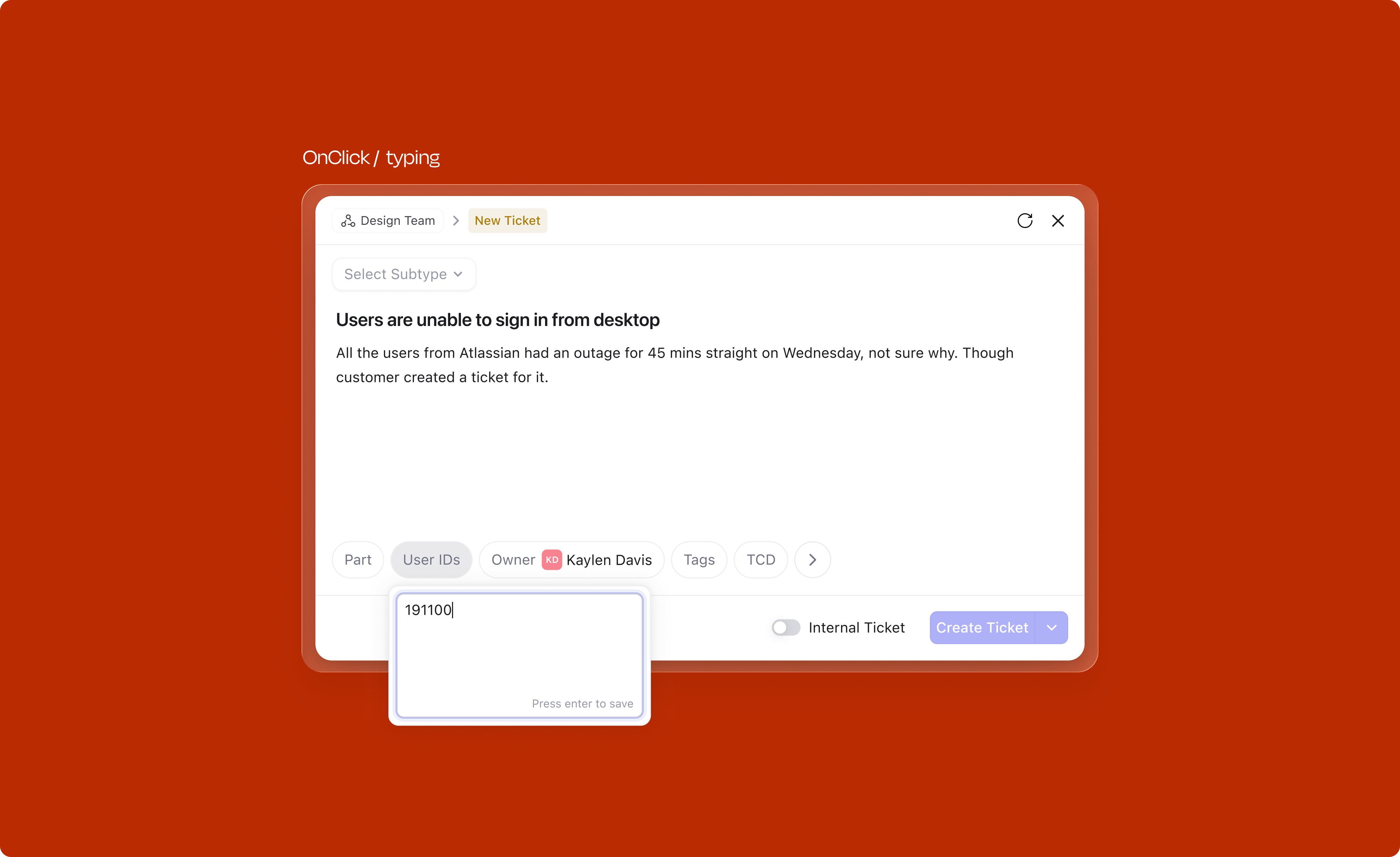
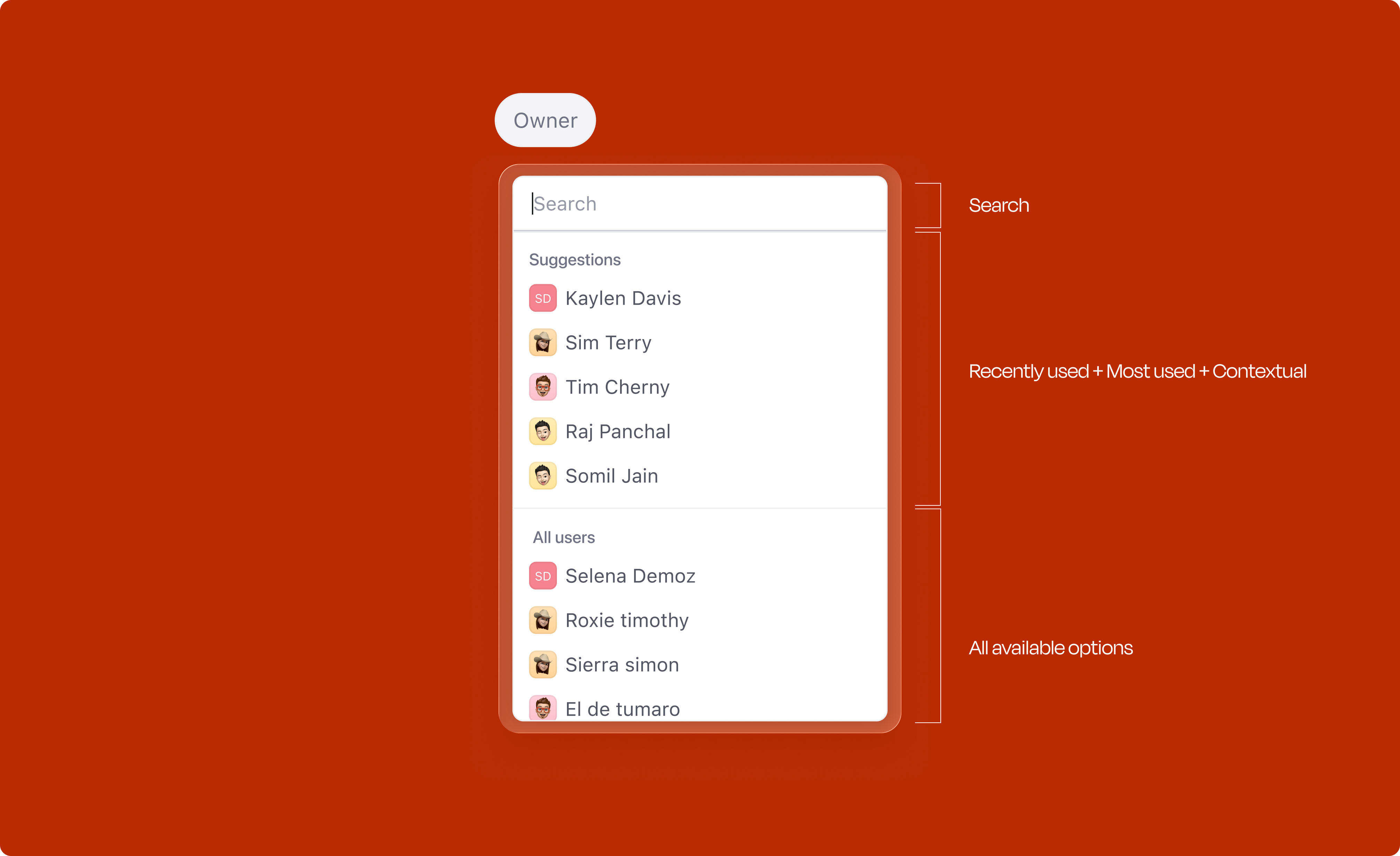
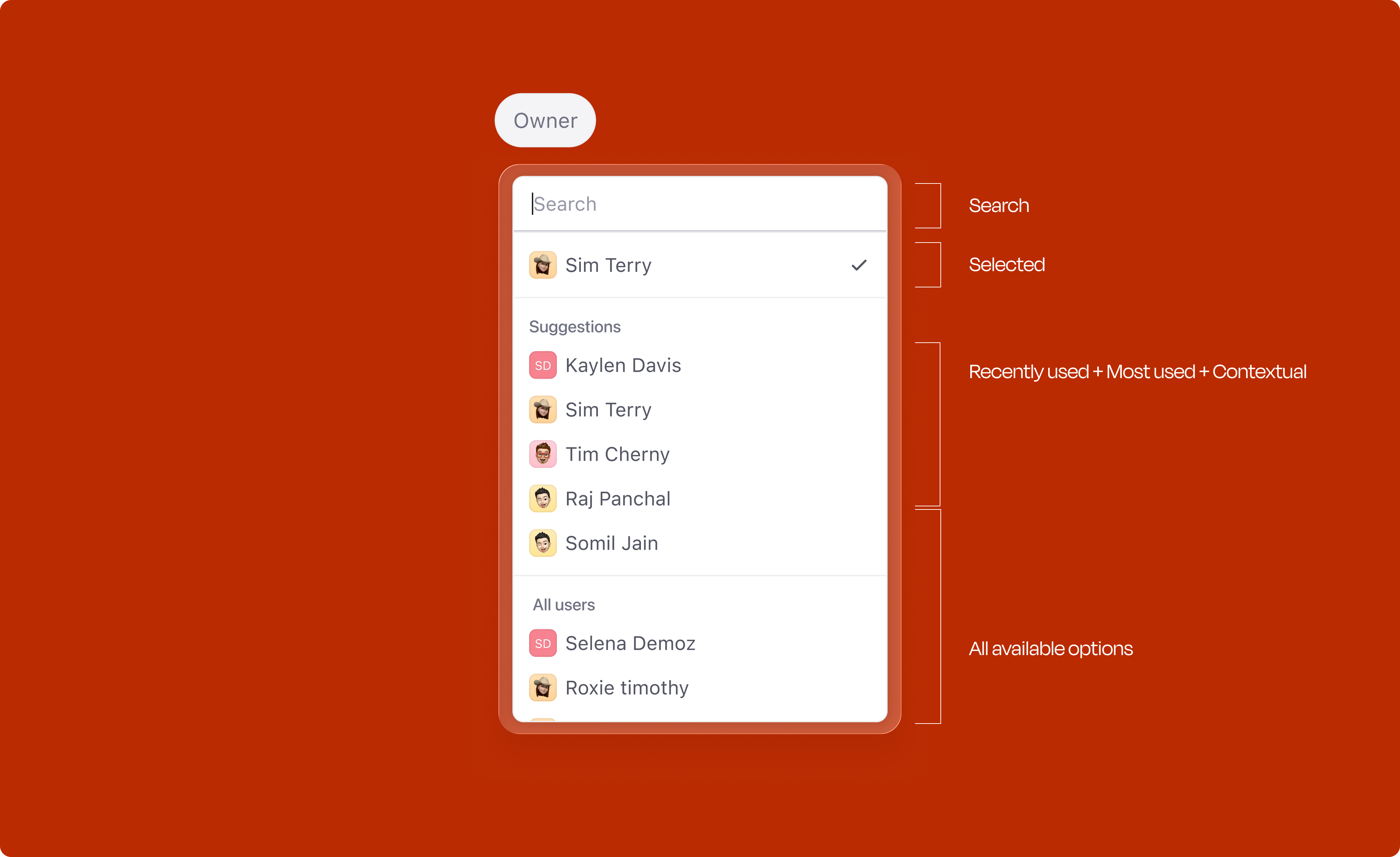
Opening any attribute dropdown doesn't just show a flat list. A Suggestions section sits at the top, built from three signals: most-used values, recently-used values, and whatever the title and description hint at. The full list is still right below. Everything is overridable; the idea is to save a few clicks on the obvious cases, not to take the decision out of the user's hands.
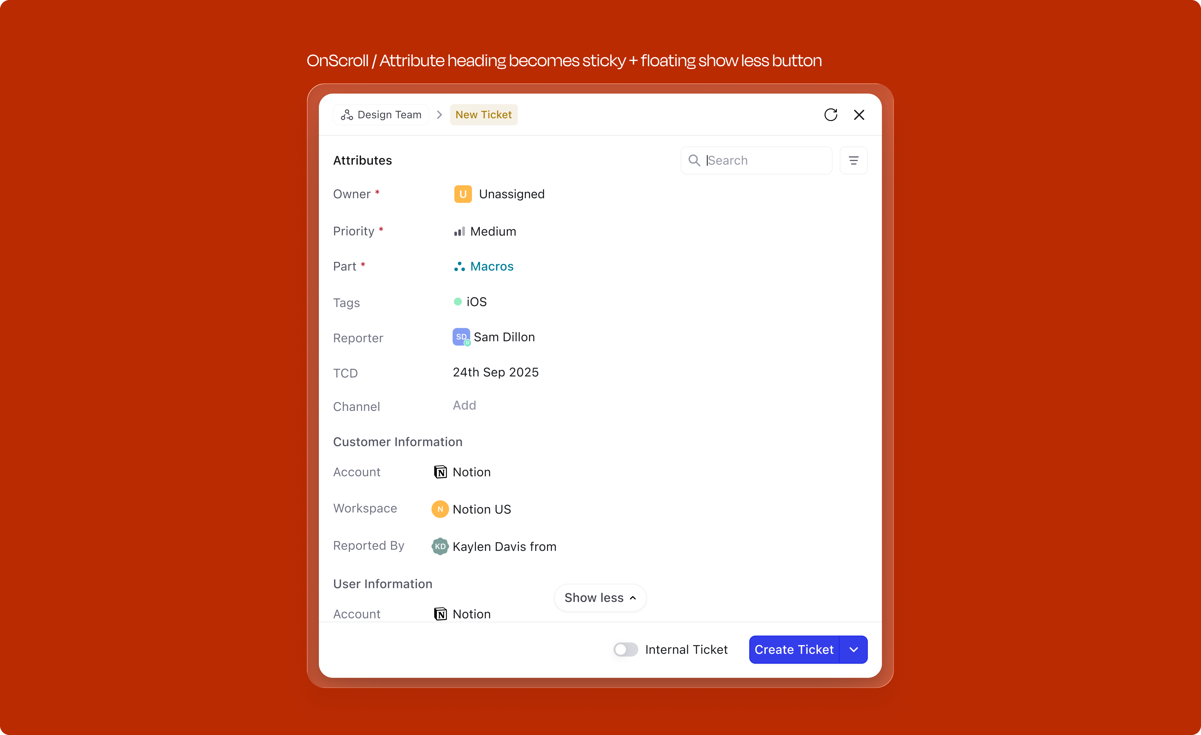
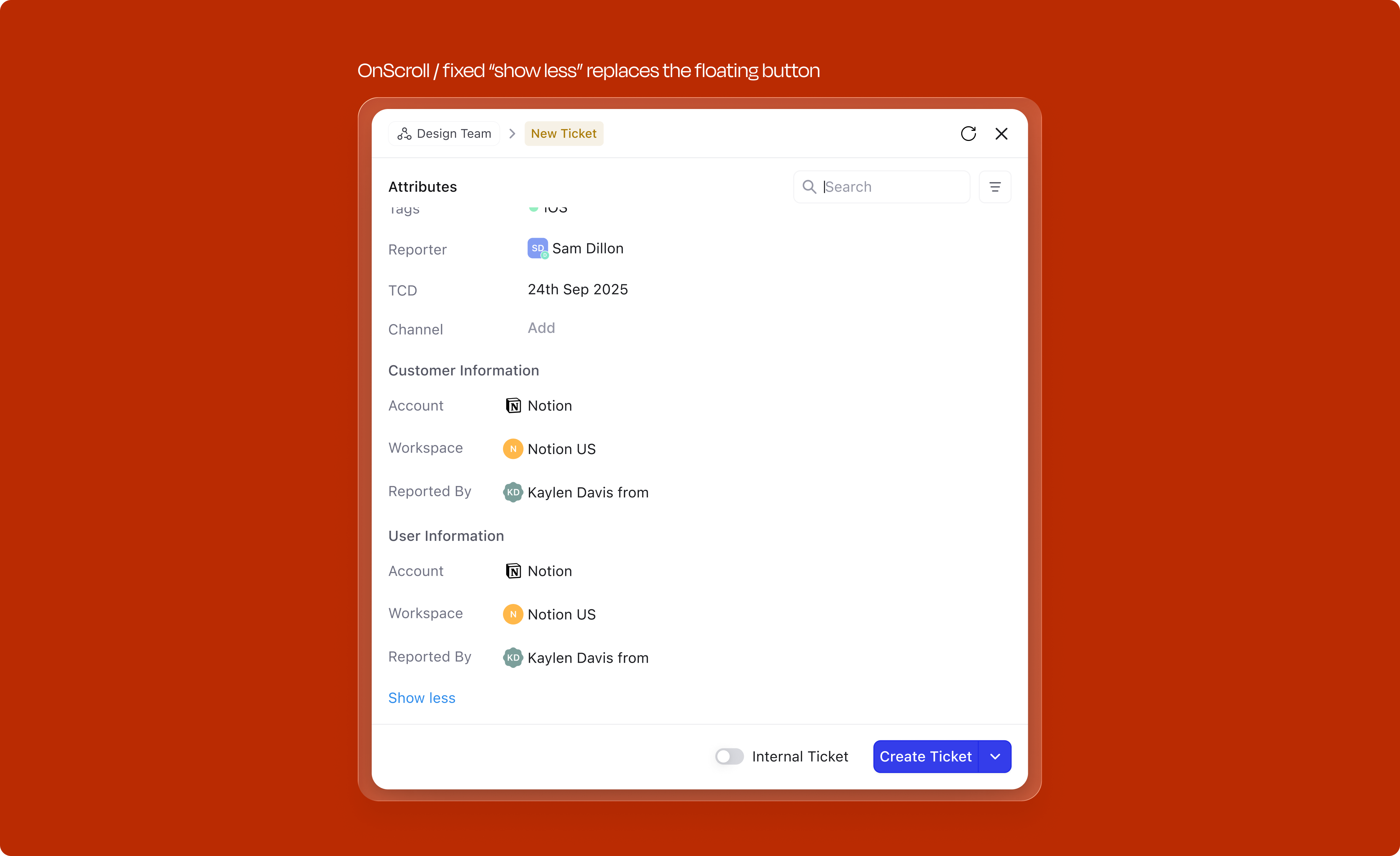
Not every field needs to be visible by default. For attributes that don't meet the criteria for automatic surfacing (mandatory, contextual, or most-used), users can access an expandable "View more" section. This tray reveals all remaining fields organized by category, searchable and collapsible. Users can add any field to the creation form, and the system learns from this behavior; frequently accessed fields from "View more" eventually graduate to the primary attribute set.
Keeps the default state tight for casual users, and gives power users the full field set when they need it. The expanded state also sticks within a session, so opening it once keeps it open for the next create.
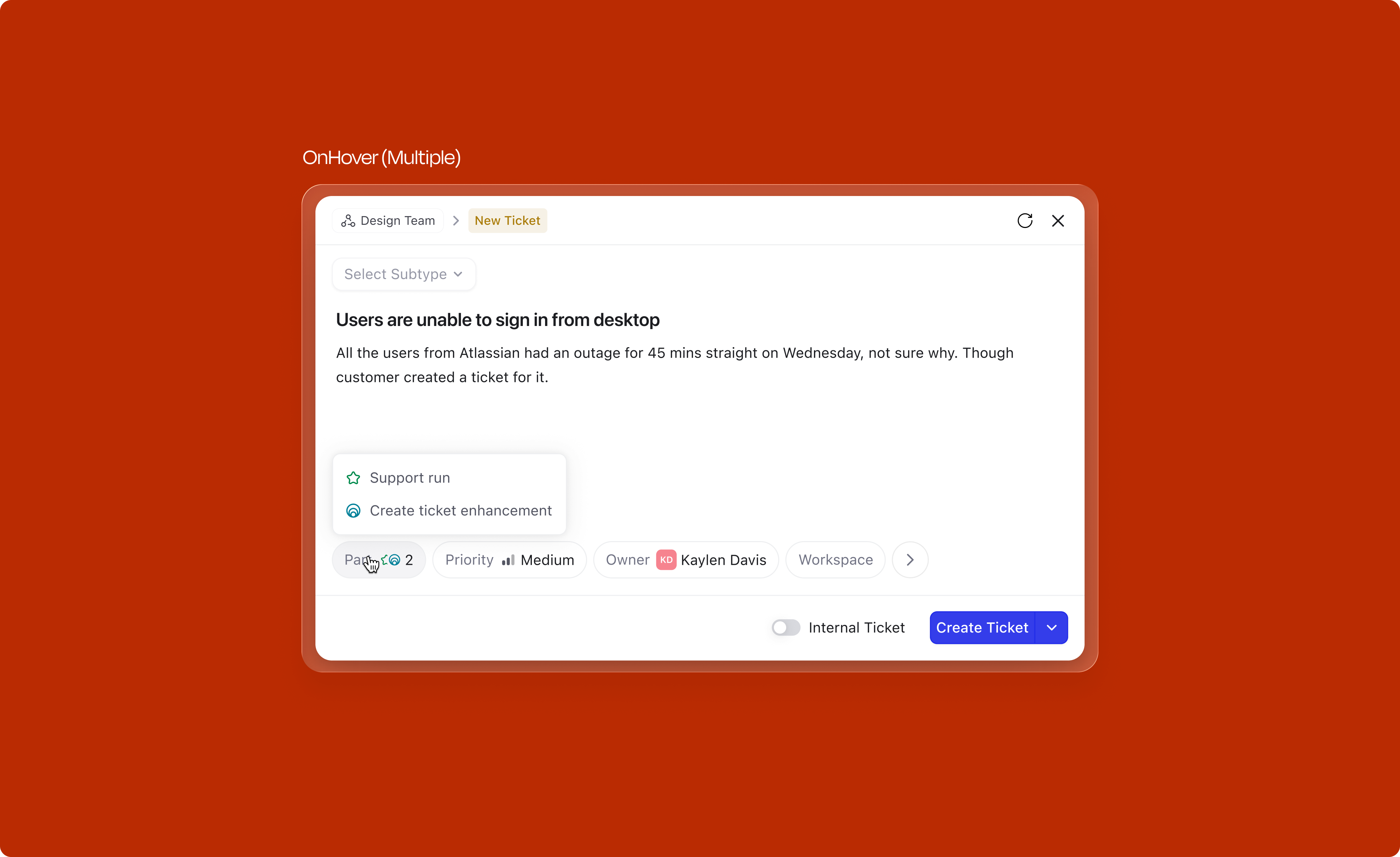
Exploring a more intentful approach
While the expandable tray works, we experimented with making the interaction more intentful. Instead of expanding a full list of fields, clicking the "more" icon opens a compact menu where the user can select a specific field. Once selected, that field chip gets added directly to the creation view and its dropdown opens automatically, saving multiple clicks.
We tested two variants: single-select (one field at a time) and multi-select (batch-add). Multi-select introduced too much complexity; users lost context when several new fields appeared at once. Single-select worked significantly better in testing. The flow felt natural: tap more, pick a field, fill it immediately. We will most likely ship this pattern in a future iteration.
View the interactive prototypeAttributes don't need to wait for the user to fill them. The system reads signals from the subtype selection, the title, and the description as the user types, and pre-fills fields before they're ever touched.
Type "login page crash" in the title and the system may default Severity to High and suggest the relevant Part. Choose the Bug subtype and the Owner field might already point to the on-call engineer for that area. The key insight driving this: even if a pre-filled value is wrong, the number of clicks to correct it is the same as filling it from scratch. So there is no downside to a confident guess.
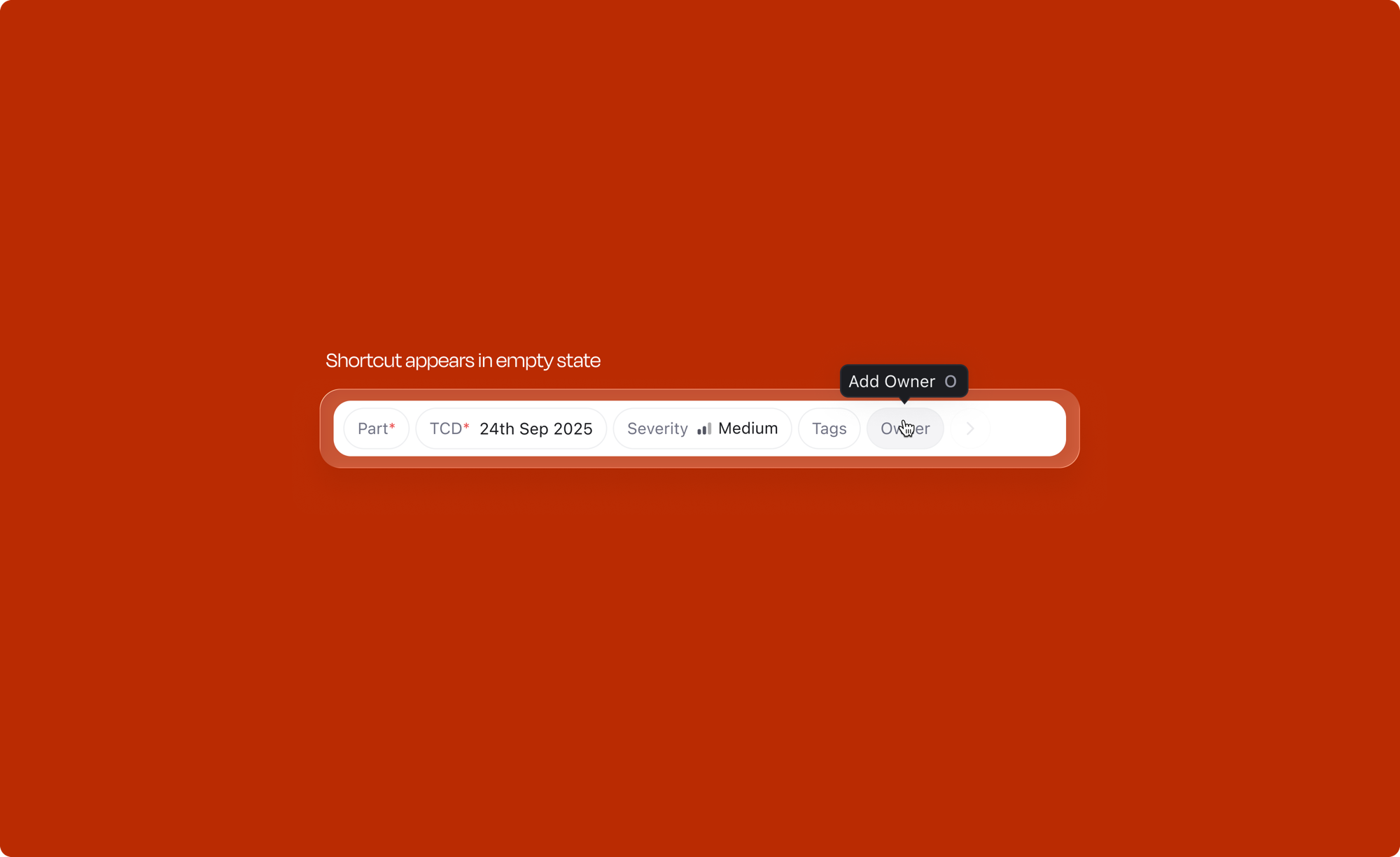
Every frequently used attribute has a dedicated keyboard shortcut. Press O to open the Owner dropdown, T for Tags, S for Severity on tickets, or ⇧S for Stage. Users can assign an item to themselves with I without opening any menu. Shortcuts are scoped by object type: ticket-specific attributes like Severity use different keys than issue-specific ones like Priority or Sprint.
Discoverability is built in. Hovering over an empty attribute chip shows a tooltip with its shortcut (e.g. "Add Owner O"), teaching it at the exact moment of interaction rather than requiring documentation.
| Action | Shortcut |
|---|---|
| Open Owner dropdown | O |
| Assign to yourself | I |
| Open Stage dropdown | ⇧ S |
| Open Tags dropdown | T |
| Open Part dropdown | ⇧ P |
| Add a comment | M |
| Action | Shortcut |
|---|---|
| Open Severity dropdown | S |
| Action | Shortcut |
|---|---|
| Open Priority dropdown | P |
| Open Sprint dropdown | ⌥ S |
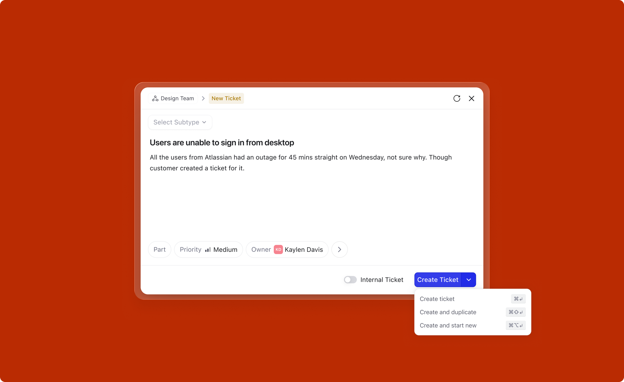
The Create button does more than just create. It offers three distinct actions via a dropdown, each mapped to a keyboard shortcut:
The core creation flow handles the 80% case well. But a product used thousands of times a day will inevitably hit the edges. Here are the cases we designed for specifically.
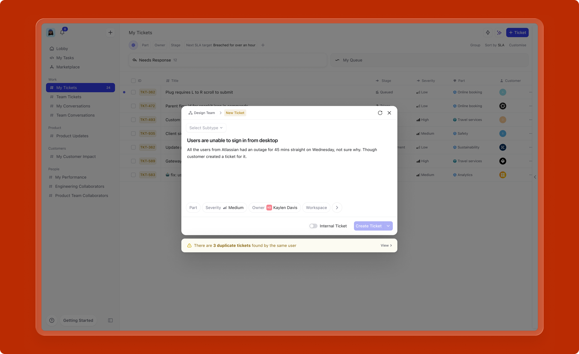
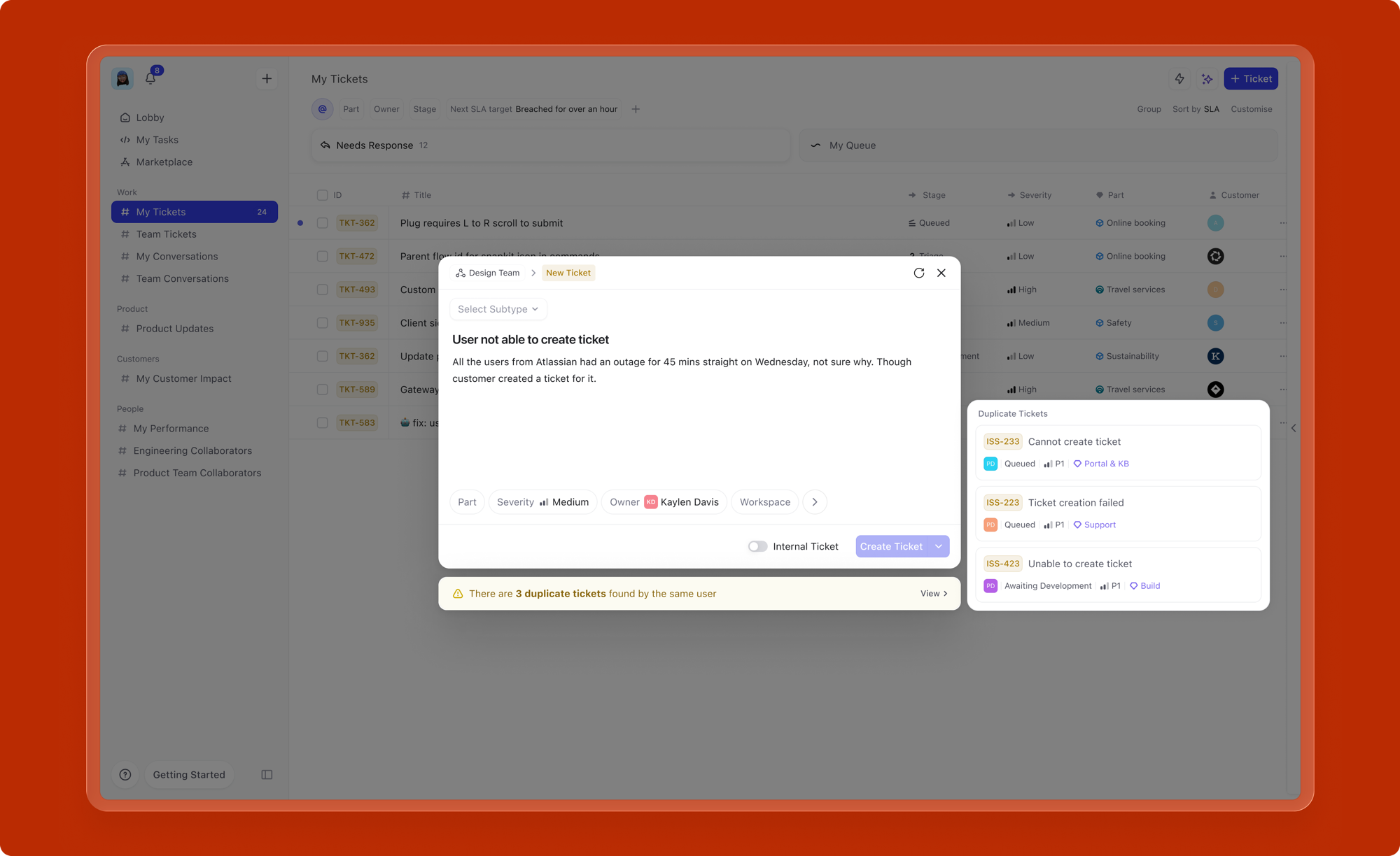
Redundant work items are a real problem in large organizations. Multiple people reporting the same bug, filing the same feature request, or logging the same incident wastes everyone's time and clutters the backlog.
As the user types a title, the system checks for existing work items with similar titles and surfaces matches inline, directly below the title field. If a potential duplicate is found, the user can view it, link to it, or proceed with creation if it's genuinely distinct. This prevents redundant creation at the point of entry, before the work item ever reaches the backlog.
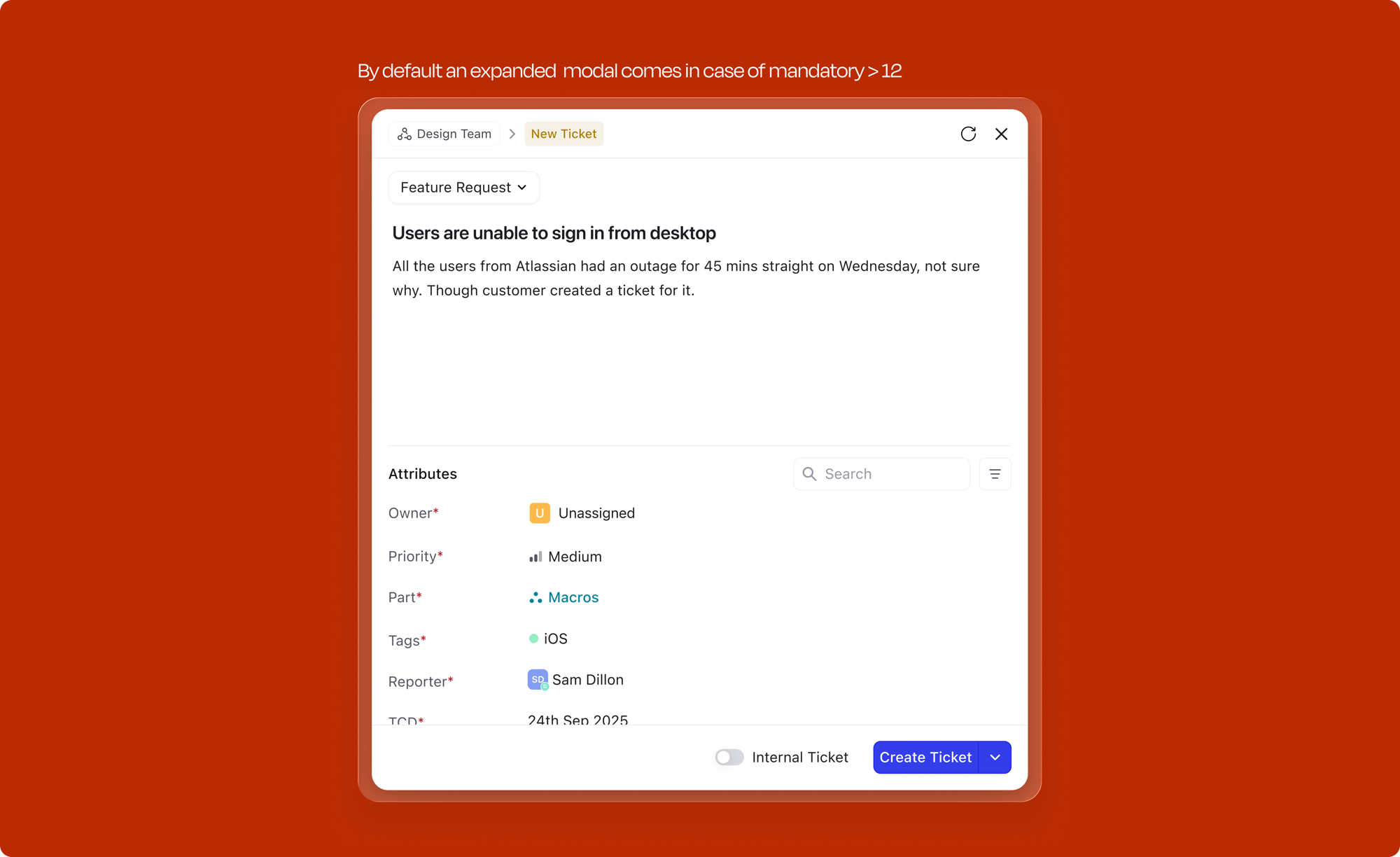
When too many mandatory fields are stacked together as pills at the bottom of the modal, legibility and readability suffer. The attribute bar becomes cluttered, and the whole experience stops feeling like a "quick" create.
For subtypes with more than 12 mandatory attributes, the modal defaults to an expanded form-like UI instead of the compact pill layout. Attributes are displayed as labeled rows with their values, searchable and scannable. Currently only 2 organizations have a subtype where this threshold is hit, making it a true edge case, but one we still designed for. The form view ensures that even heavily configured subtypes remain usable without sacrificing the creation experience for everyone else.
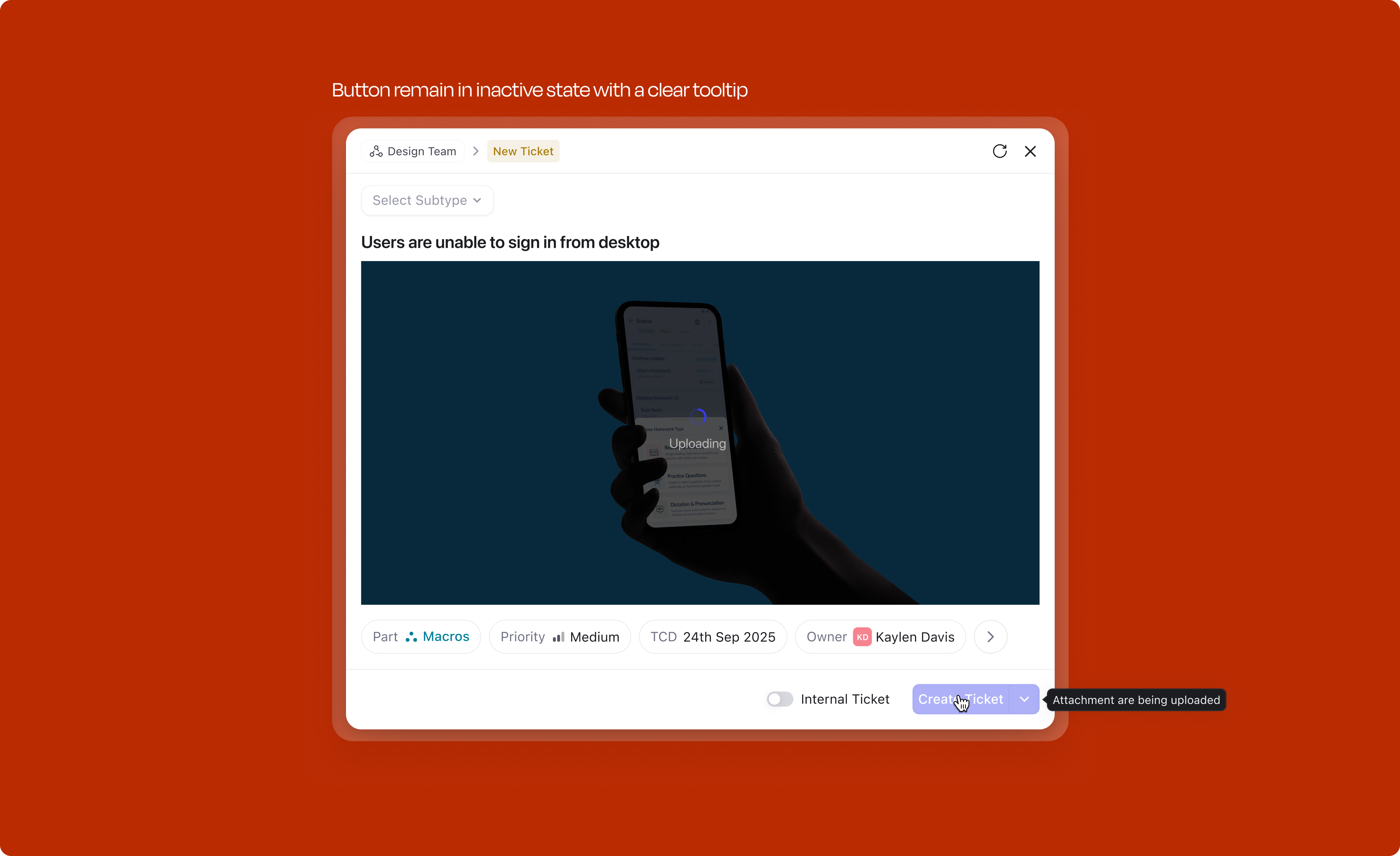
When a user has attached media (images, files) to a work item and it is still uploading, the Create button is disabled. A tooltip on hover explains why: "Media is still uploading." This prevents creation of a work item with broken or missing attachments; the user is never left wondering why their screenshot didn't make it through.
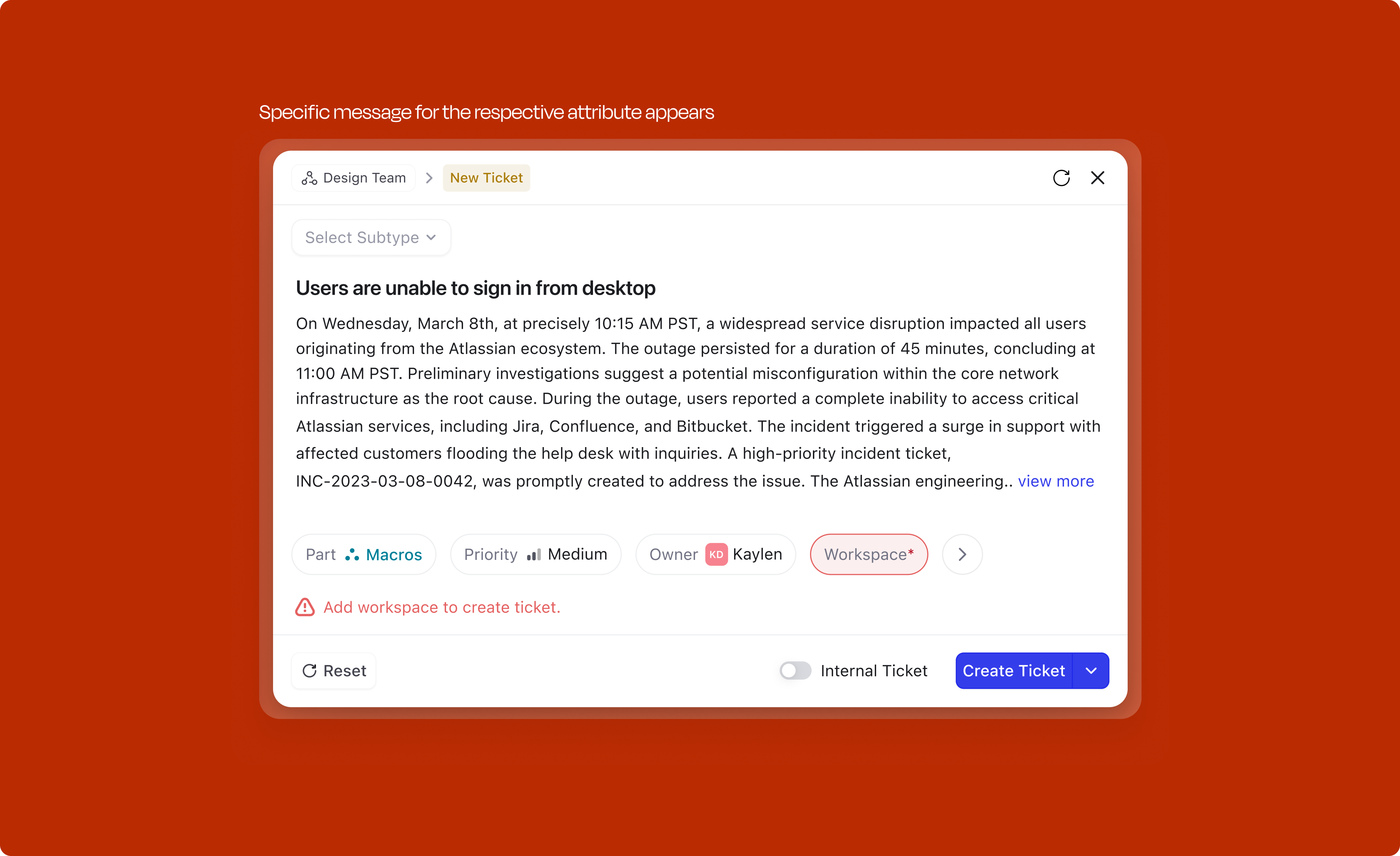
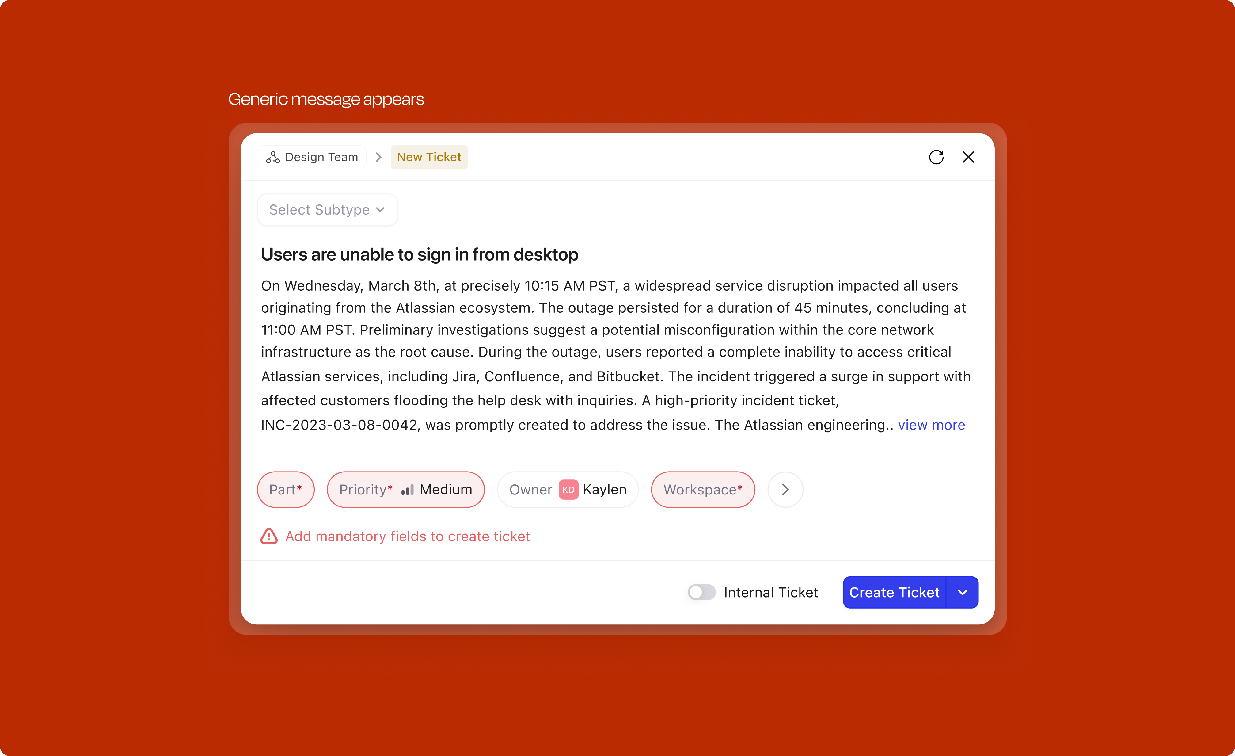
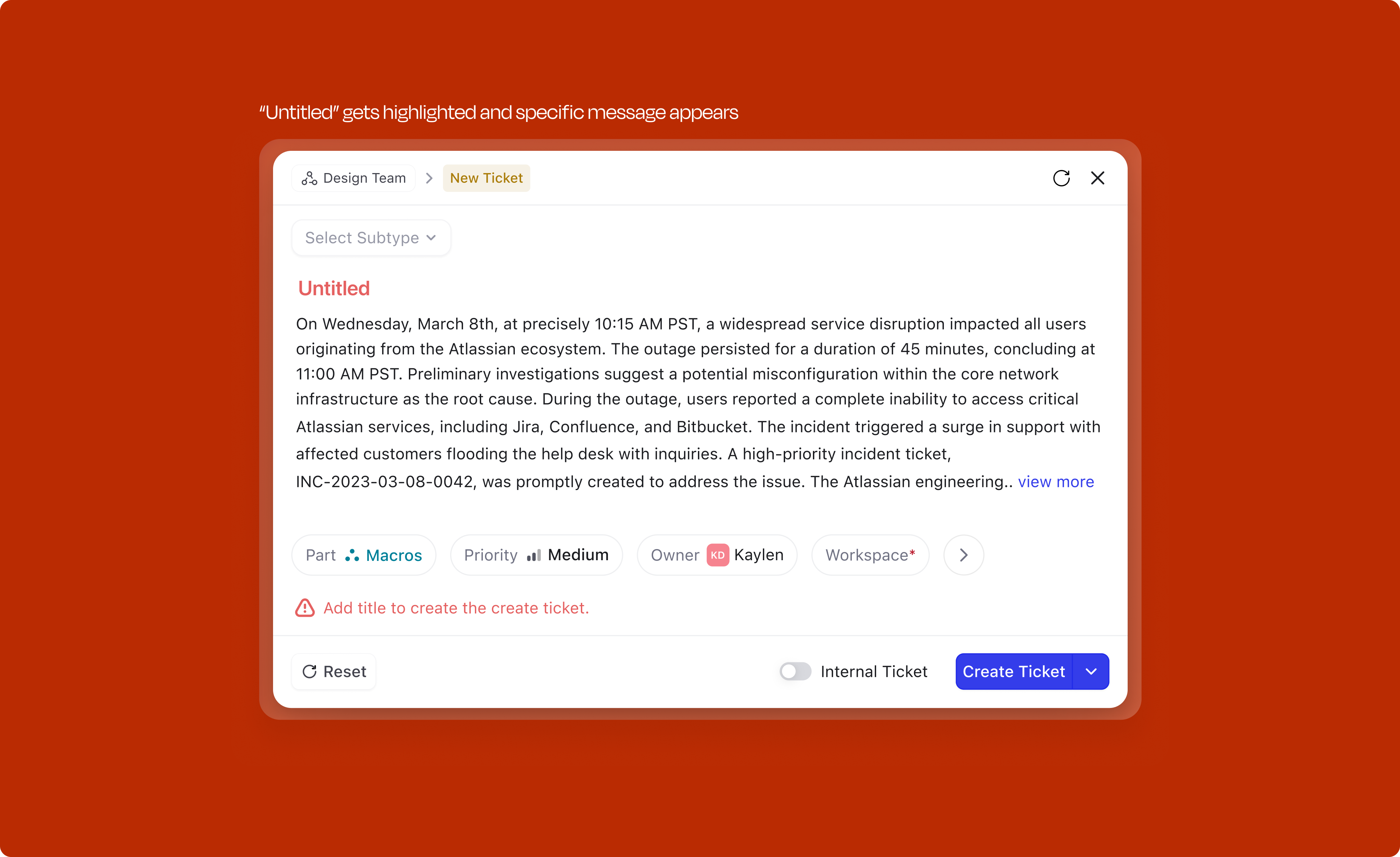
Two distinct categories of errors can surface during creation, and the handling is different for each.
Validation errors (user-side): When a user tries to submit with mandatory fields unfilled, the modal doesn't just block silently. The feedback is contextual:
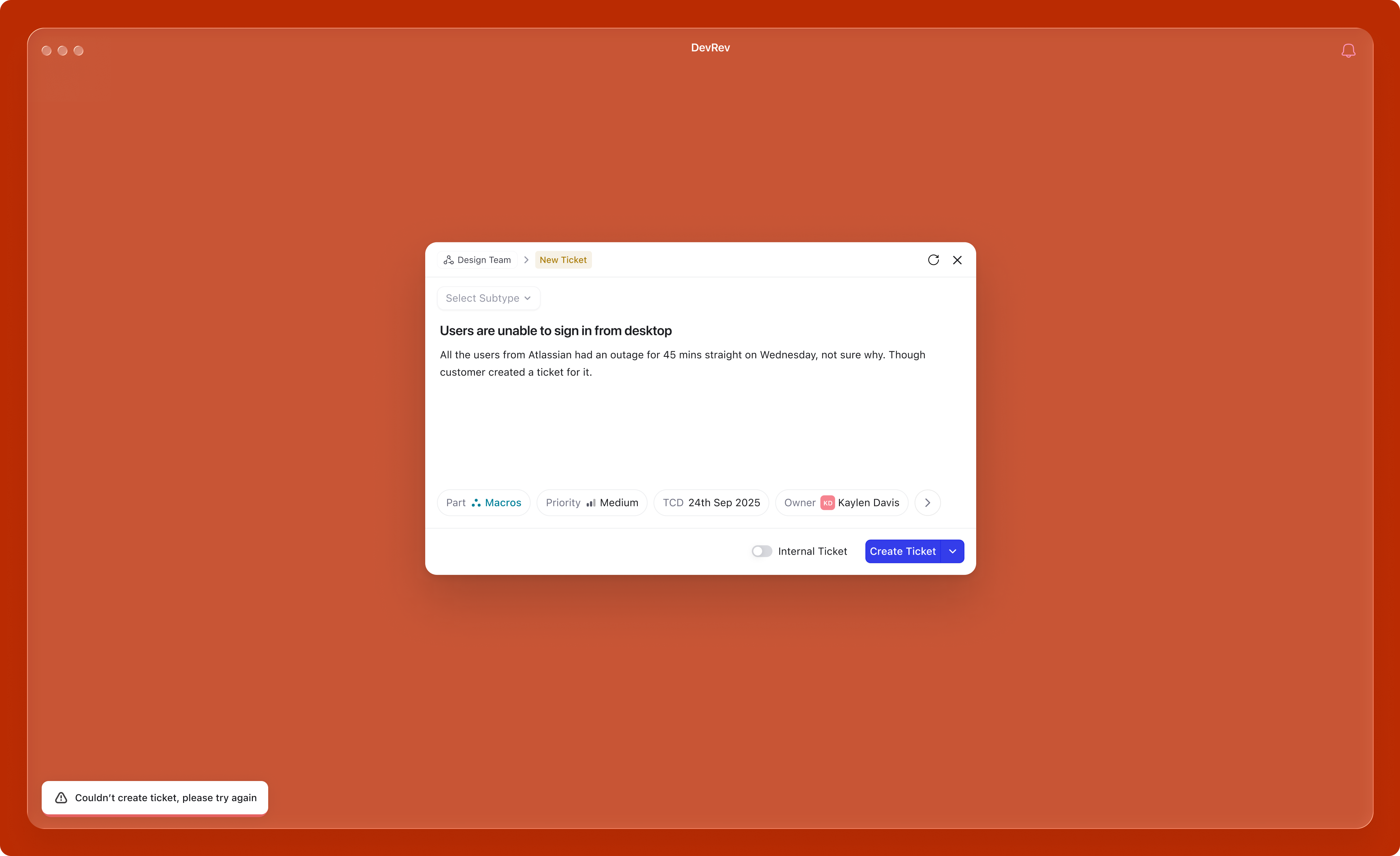
Server errors (system-side): When the user has done everything correctly but something fails on the backend, the experience shifts entirely. The user shouldn't feel at fault. A toast message appears with "Something went wrong. Your draft has been preserved." The modal stays open with all their input intact; nothing is lost. A retry button lets them try again without re-entering anything. If the error persists, the message escalates to "Unable to create. Please try again later." The core principle: server failures should never punish the user for the system's problem.
Attributes don't exist in isolation. Changing one can trigger cascading changes elsewhere in the modal, and these need to feel immediate and legible to the user. Two types of cascades happen: auto-fill (selecting a Part pre-fills the Owner based on team config) and new mandatory fields (selecting a Part can surface a new required field right next to the trigger, not buried in the overflow tray).
Click any attribute to set a value and see what changes cascade.
Users sometimes abandon a half-filled modal — accidentally hitting Escape, navigating away, or losing a browser tab. Without a safety net, everything they've typed is gone.
The modal autosaves its state to local storage as the user types. The next time the user clicks +New, a dialog appears giving them a choice: Start new or Restore draft. Restoring repopulates the title, description, subtype, and any filled attributes exactly as they were left. Starting new clears the draft cleanly and opens a fresh modal.
Drafts are scoped per work type (a ticket draft doesn't show up when someone opens issue creation) and they expire after 24 hours so old context doesn't get pushed at the user.
An explicit Save as draft action is planned for phase 3, which matters for users who want to deliberately park a work item and return to it later. For now, the autosave-and-restore pattern covers the everyday case of accidental loss, and that's what ships.
The North Star is simple: how long does it take to go from intent to a created work item? The competitive benchmark was Linear. The supporting metrics track whether the design decisions are landing.
This project reinforced several things about product design:
Given another run at this, the upfront investment would go further into instrumenting the existing creation flow. Strong qualitative signals existed (30+ interviews), but richer quantitative data on drop-off points and time-per-field would have sharpened prioritization.